Streamlining File Search & Download
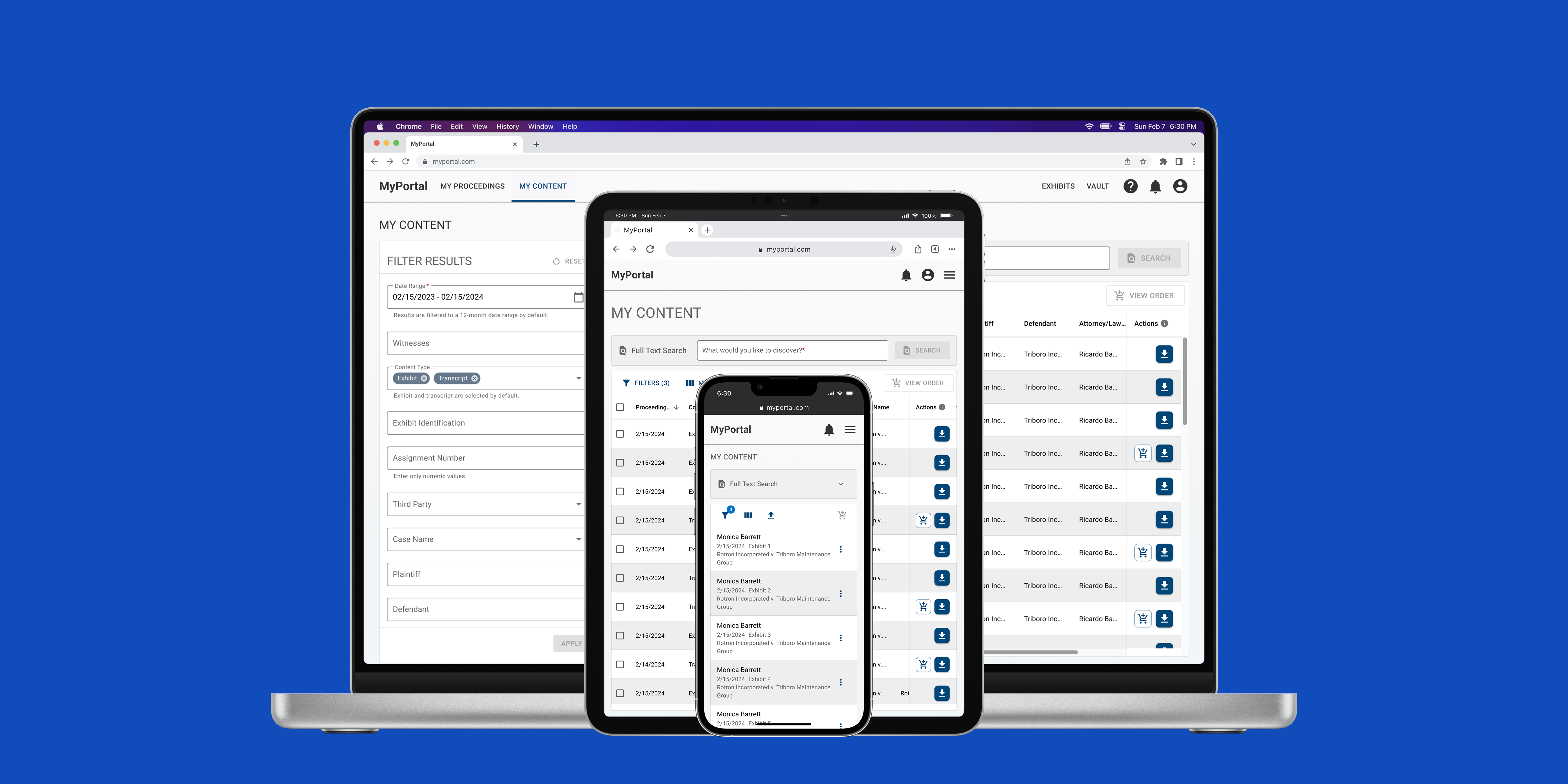
MyPortal is Company X's self-service platform for law firms to order services, manage proceedings, and access proceeding content (e.g. transcripts, exhibits, and videos).
Access to MyPortal is included in all contracts but only 20% of all customers are active users. Of that proportion, 30% of support tickets were usability issues. There was low user adoption and Company X's stakeholders wanted to turn this around so that internal resources could be utilized for less manual tasks.
Success metrics
The ultimate objective was to improve user adoption. Our team established the following metrics to work towards this objective.
Increase file downloads
Reduce the amount of support tickets
Decrease time spent on searching for files
User problems
Support tickets were reviewed with the product manager to assess the user pain points. We set aside truly technical tickets and evaluated the usability related tickets to find common themes.
“I can't confirm the file I want because the information is hidden.”
“There are so many filter options and no easy way to search.”
“Is there a way to download files across cases? It takes too long right now.
“I need help figuring out this website. I'm having trouble selecting files for download.”
Spending too much time finding the right files and initiating downloads.
Attorneys and paralegals use MyPortal to access finalized proceeding content needed to build their legal cases. They need to focus on analyzing case content and building their cases, however, their productivity is hindered by the excessive time spent gathering content.

High-level process of the legal content gathering process
Approach
How might we make it more efficient for users to gather their post-proceeding content?
Goal 1: Search and filter
Improve filtering and data display.
Goal 2: File selection and download
Enable multi-selection for bulk download.
Usability issues
Information that's too hard to reach
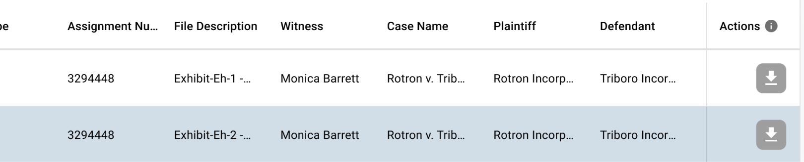
The existing UI had expandable cards which were not conducive to viewing large data sets. Pertinent information, files, and actions are obscured.
Bulk actions aren't so simple
A bulk download option existed but with significant restrictions. Users could only download content within one category at a time, preventing them from selecting content across different categories in a single action.
Segmented searches
The “Full Text” search gave users the ability to search within content, but the experience was split across tabs — one for content search and another for full text search — which made the process feel fragmented.
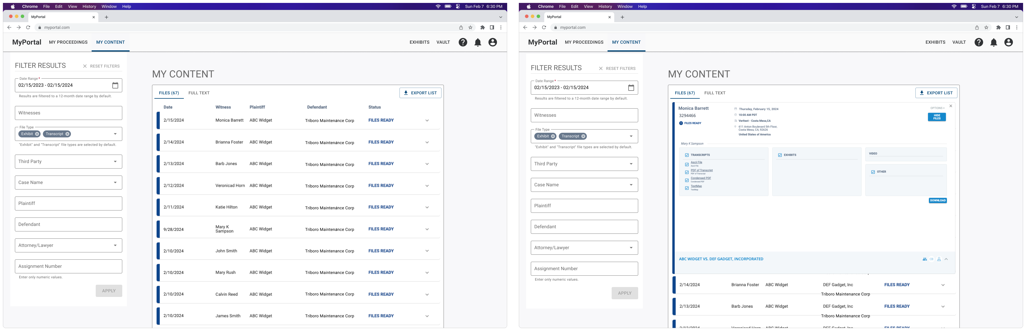
Previous state of the UI
Design approach
Attorneys and paralegals owned hundreds, maybe thousands, pieces of content. We knew we needed a solution to display and organize large data sets and make bulk actions easier.
Goal 1: Search and filter
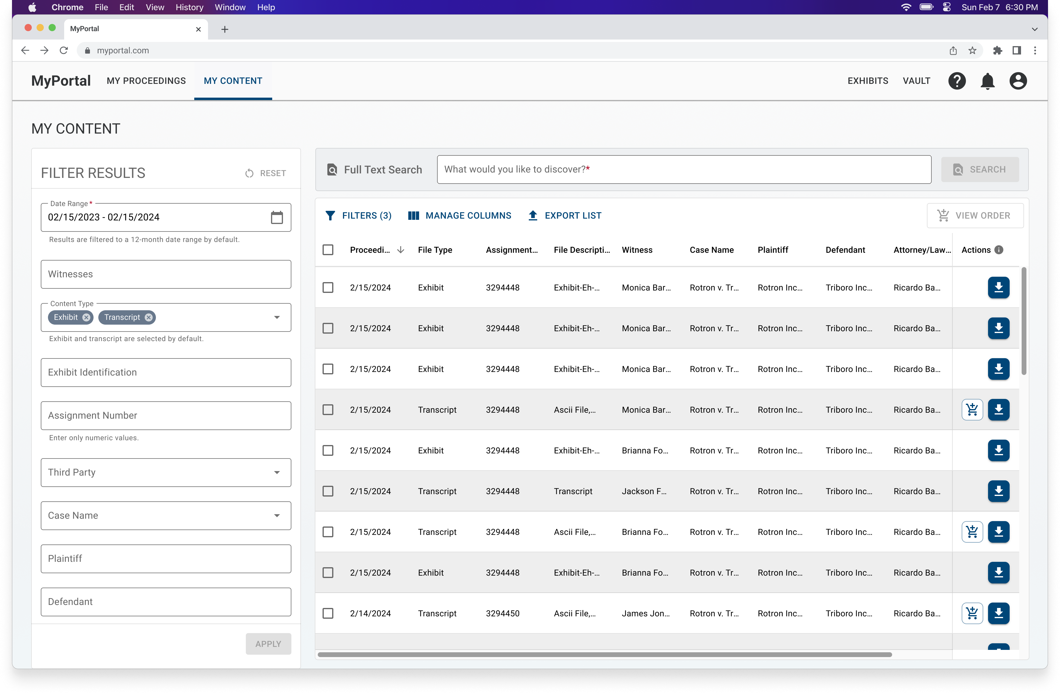
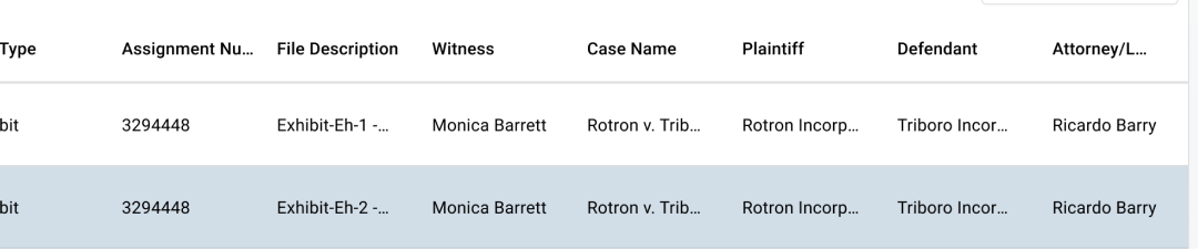
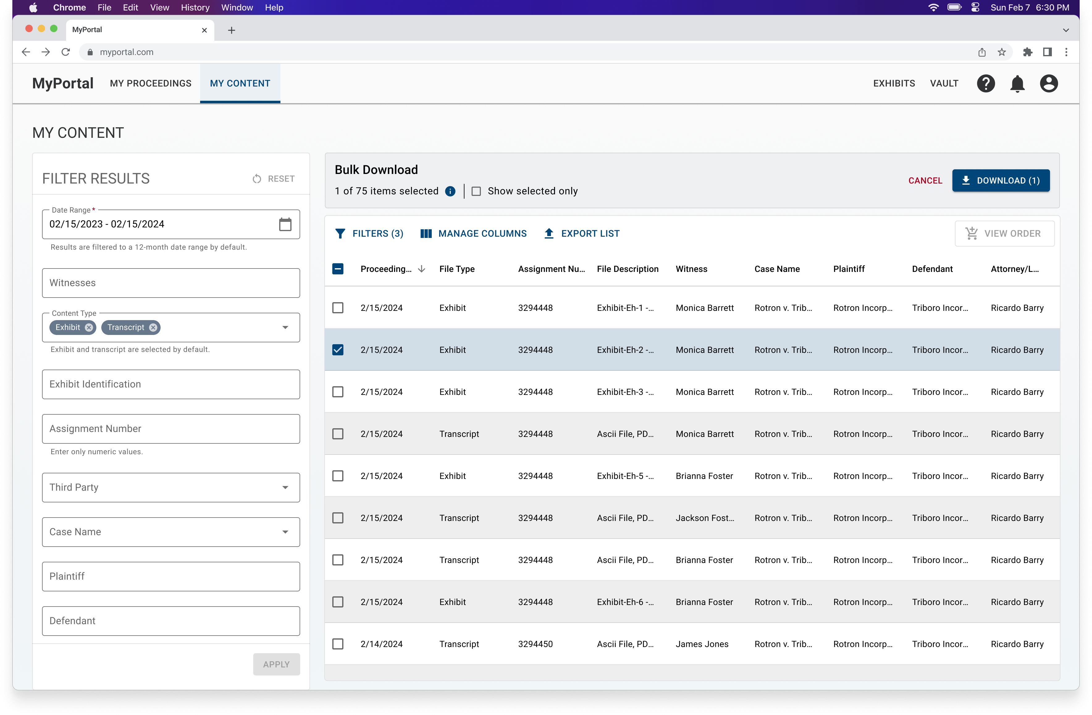
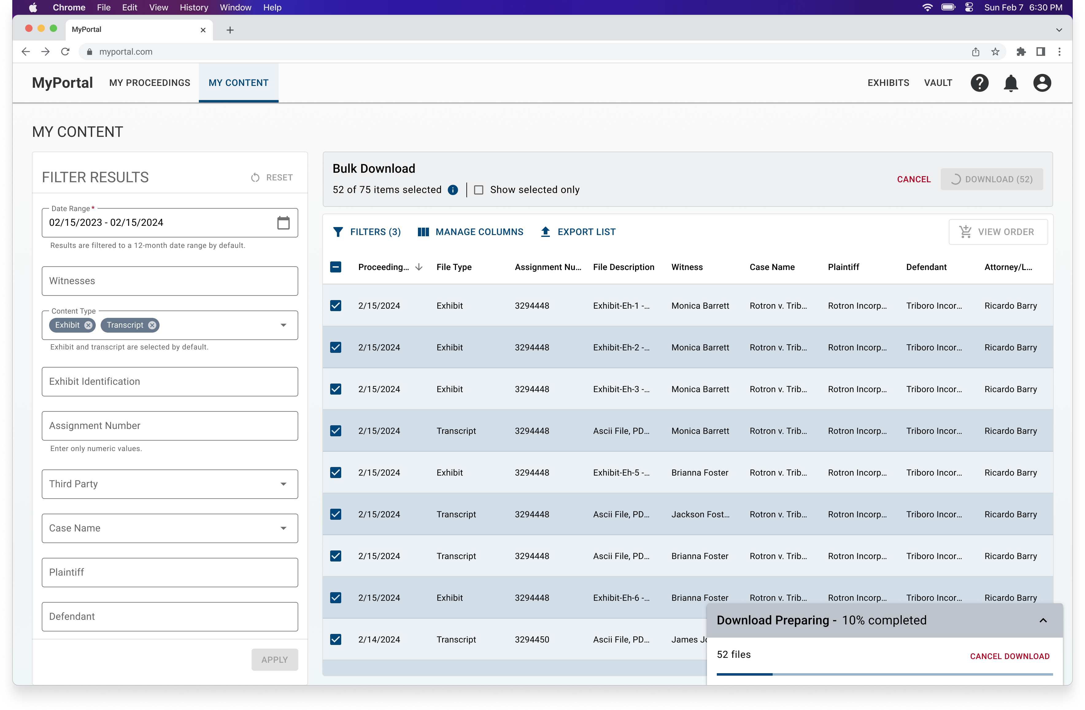
Given the large volume of data, we decided data tables were the most effective solution to improve the way users view their information. This approach was scalable to varying data sets and leveraged familiar patterns, such as filters and interactive table elements.
We took this opportunity to address the segmented searches by removing the tabular view and streamline the experience by creating a single view.
Goal 2: File selection and download
Naturally, the data table removed the cross-category constraint that existed during bulk actions.
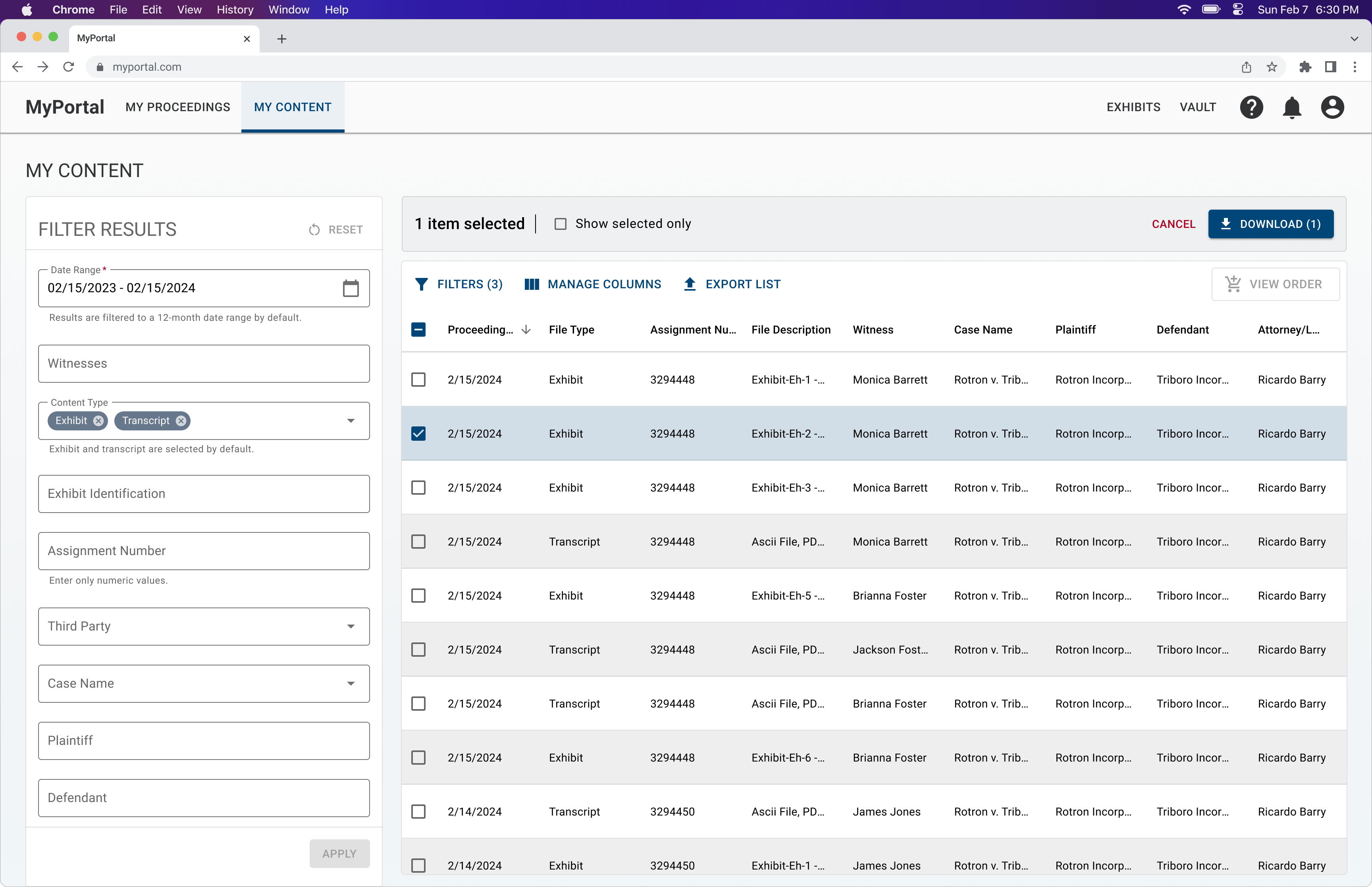
Bulk action is triggered with a file selection.
Feedback
Concerns regarding information overload
A major piece of feedback I received from the team was that there was too much metadata shown, referring to the amount of columns in the data table. I responded to this feedback was by providing some key principles to address these concerns.
Key Principle 1
User control through customizable table configuration.
Key Principle 2
Users are searching for information that fit specific criteria.
Key Principle 3
Column order and pre-filtered data is based on relevancy.
Key Principle 4
Single and bulk actions are made apparent to users.
Technical constraints
There was a maximum number of files that could be included in a single download due to performance concerns.
Design updates
We weren't approved to conduct usability testing with users, however, I was able to iterate on the designs based on team member feedback and leveraging UX best practices (refer to some of the resources at the end of this page).
Maximum item selection


Reduce noise during bulk download
The final designs
Impact
The feature was released in December 2024. Since the release, we have been able to observe a positive impact.
22%
increase in file downloads
30%
decrease in support tickets