Driving Platform Modernization Through Strategy
Veritext is the top national agency for legal services. Vision is their enterprise application that lets their schedulers add, manage, and fulfill jobs.
Schedulers are tasked with keeping job information accurate while also maintaining close relationships with law firms to ensure customer satisfaction. However, the current data management process is tedious and inefficient, diverting valuable time away from building and maintaining these relationships.
Business problems
Long turnaround time to fulfill jobs.
Duplicate data records costs time.
Undocumented business rules.
User problems
Workarounds due to ambiguous business rules.
Form navigation was confusing.
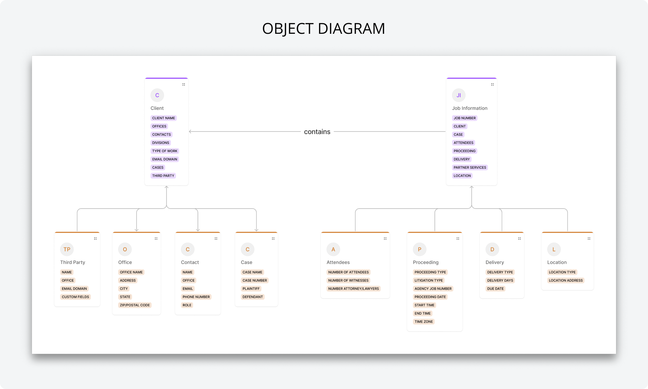
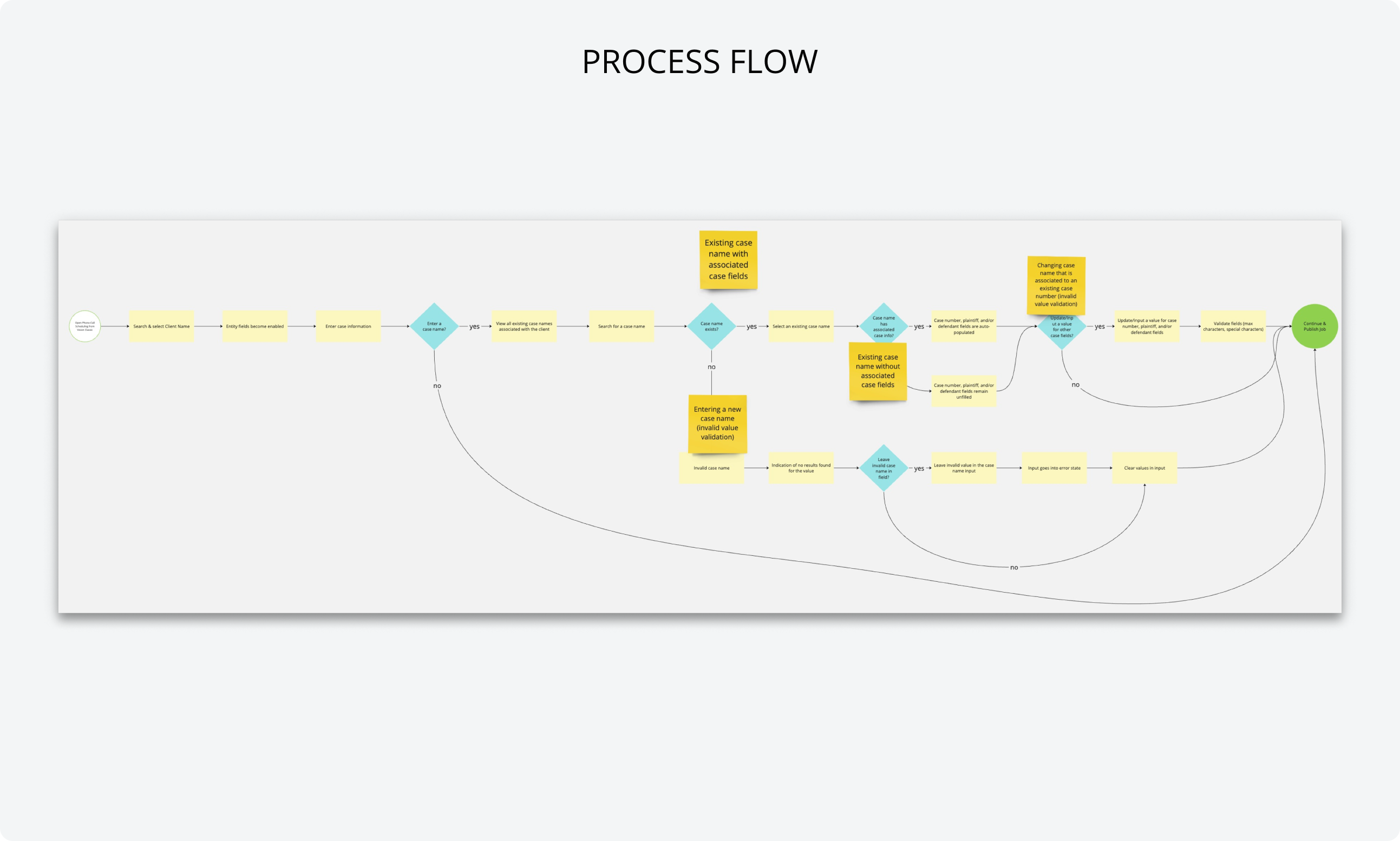
Problem 1: Undefined Business Rules
Defining the rules was not my role nor was it to train the schedulers on the business rules. The goal was to facilitate an understanding of the rules across the product, development, and design teams. A common understanding would help navigate us towards a common product vision.
Approach
As a part of the design process, we had in-depth reviews of the object diagrams and process flows for each user task. These reviews turned out to be very fruitful, as we often found misalignment on the architecture.
Outcome
The in-depth reviews culminated in the form of the implementation. But incremental progress had to be made to reach the final solution. In this case, we leveraged the diagrams and flows to inform our decisions. Below are examples of some visuals we utilized:
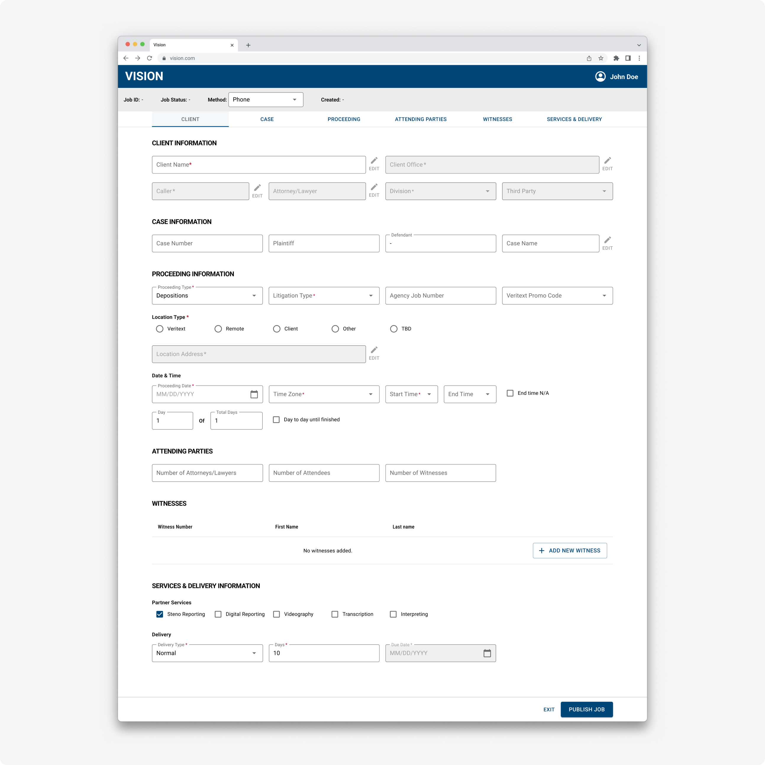
Problem 2: Form Navigation
New schedulers stated they had trouble finding information on the form, while experienced schedulers learned to become familiar with the form information. This was an indication that onboarding new employees would be costly, as the learning curve would cost time and money.
Entry of job information was not a linear process and schedulers needed a way to jump between information.
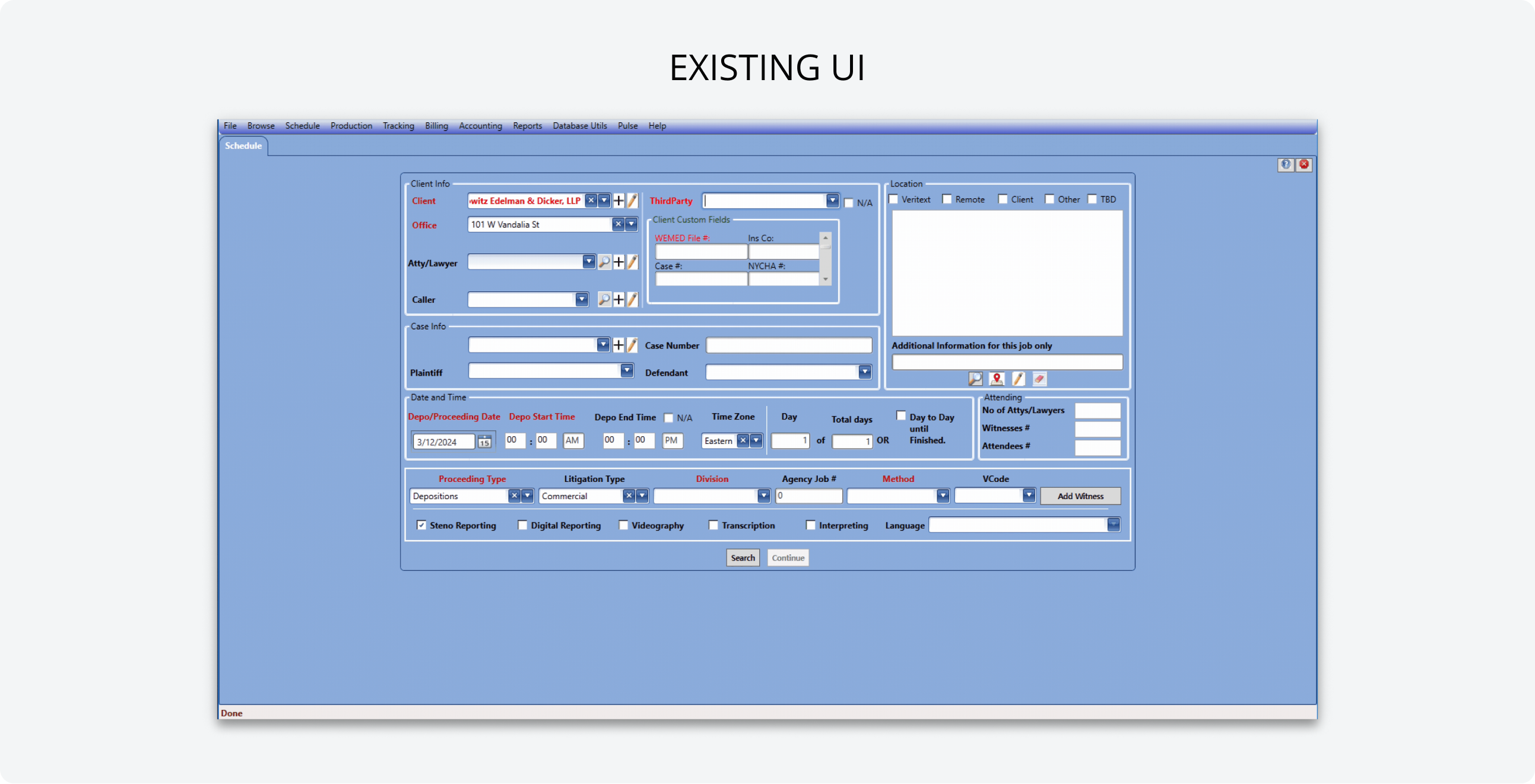
Approach
A single-page form was necessary for efficiency, as data entry was not linear. We focused on the logical grouping to improve the ease of navigating between content groups.
Final Solution
With constant collaboration with the PO, were landed on a logical grouping for the information. Once this grouping was decided, we decided to use anchor links as the method of allowing users to jump around on the page.
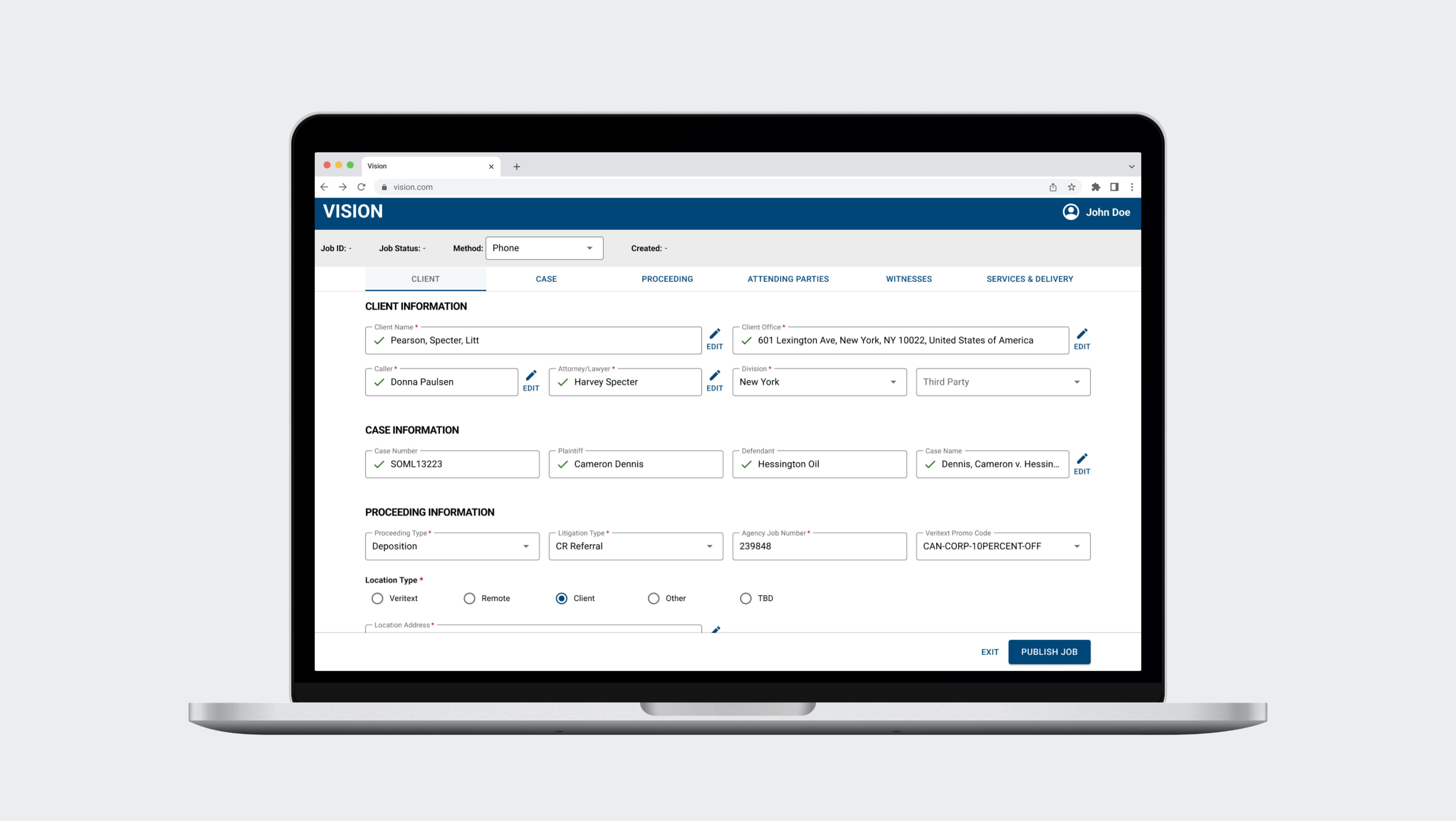
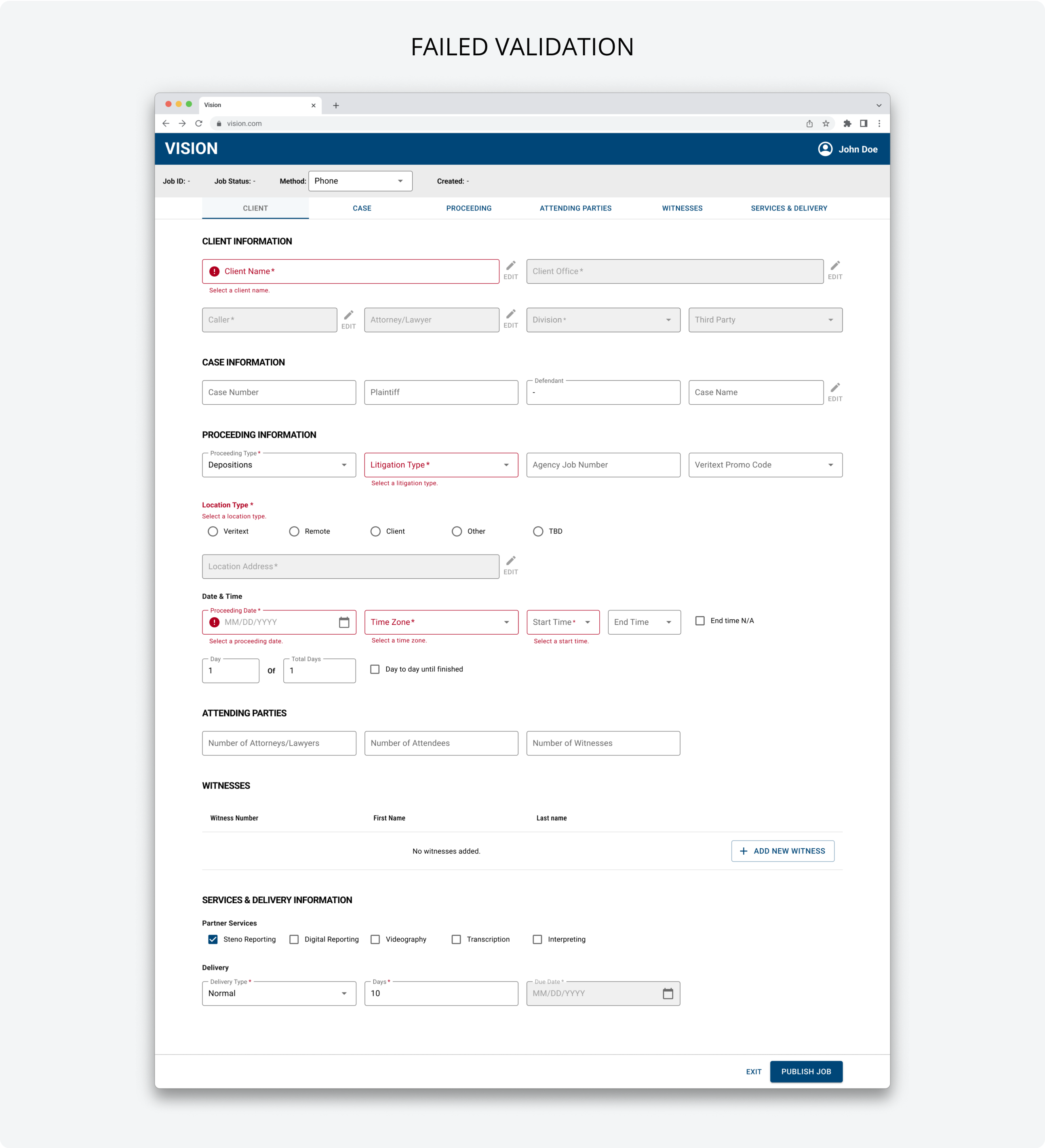
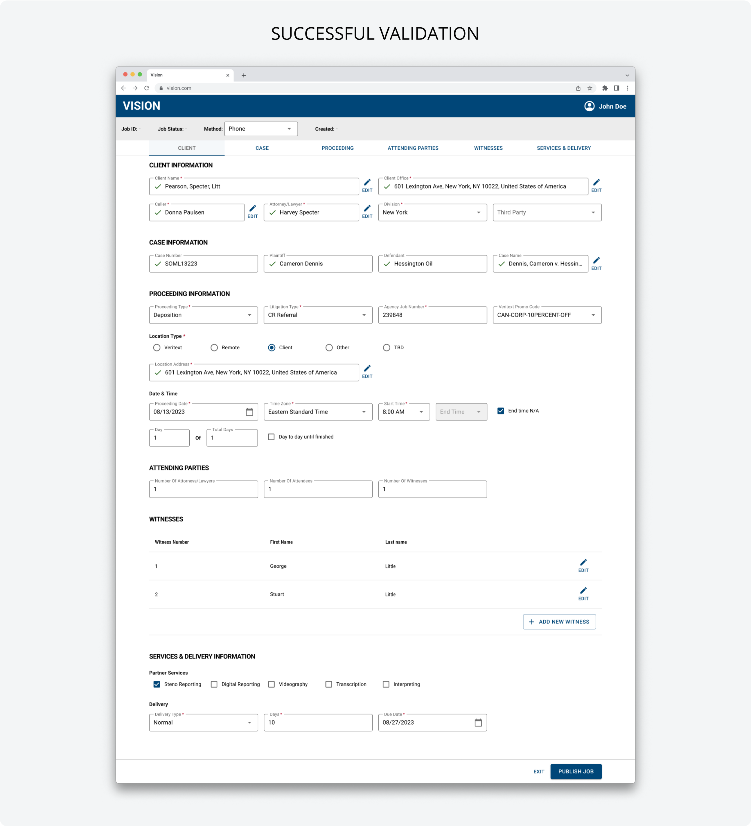
Problem 3: Error Prevention
The existing UI lacked clear form validation patterns and concise messaging to help schedulers identify and resolve errors. Schedulers could not determine whether the information entered was a duplicate, invalid, or acceptable record.
Inconsistent form validation patterns
Ambiguous error messaging
Approach
We established content guidelines in the design system that was consistent with the professional and active identify of the brand.
Final Solution
The delivered designs included inline field validations with error helper text that is representative of the proposed content guidelines. For fields with conditional rules and structured data, we used iconography to clearly communicate the validation status.
Impact
I rolled off the project before the application was released. The goal is to begin beta testing for time to complete the form.
Next steps
I handed off the project to another designer, as I onboarded to the client's customer-facing platform. The plan for this application was to wrap up more features and create a rollout plan for beta users. Eventually, the client would shutdown the legacy application and have all users use the next gen application.