Redesigning A Data Migration Platform
An application that provides tooling to manage large data sets in preparation for developing and monitoring migrations of workloads.
About the Company
The client is a consultancy firm that provides end-to-end data migration services for enterprise customers (e.g. finance companies, charitable organizations, government). The goal of the application is to manage data sources and provide users with the analytical data for them to develop and monitor migration plans.
Business Problems
- Poor adoption of current solution resulting in a fragmented business process across data analysts and project managers
- Unable to provide customers with transparency into the project because metrics are difficult to gather
Success Metrics
- Increase engagement from the data analysts and project managers by having them complete 80% of their projects within the tool in the first 6-months of initial release
- Increase satisfaction rating from the data analysts by 2 points in the first 6-months of initial release
Understanding the Users
We interviewed multiple data analysts and project managers in order to develop our personas for the team to empathize with throughout the design engagement. With one-on-one interviews, we were able to synthesize the results to identify these main user problems:
- Difficulty maintaining a relationship with customers and too much time spent proving progress instead of doing their job
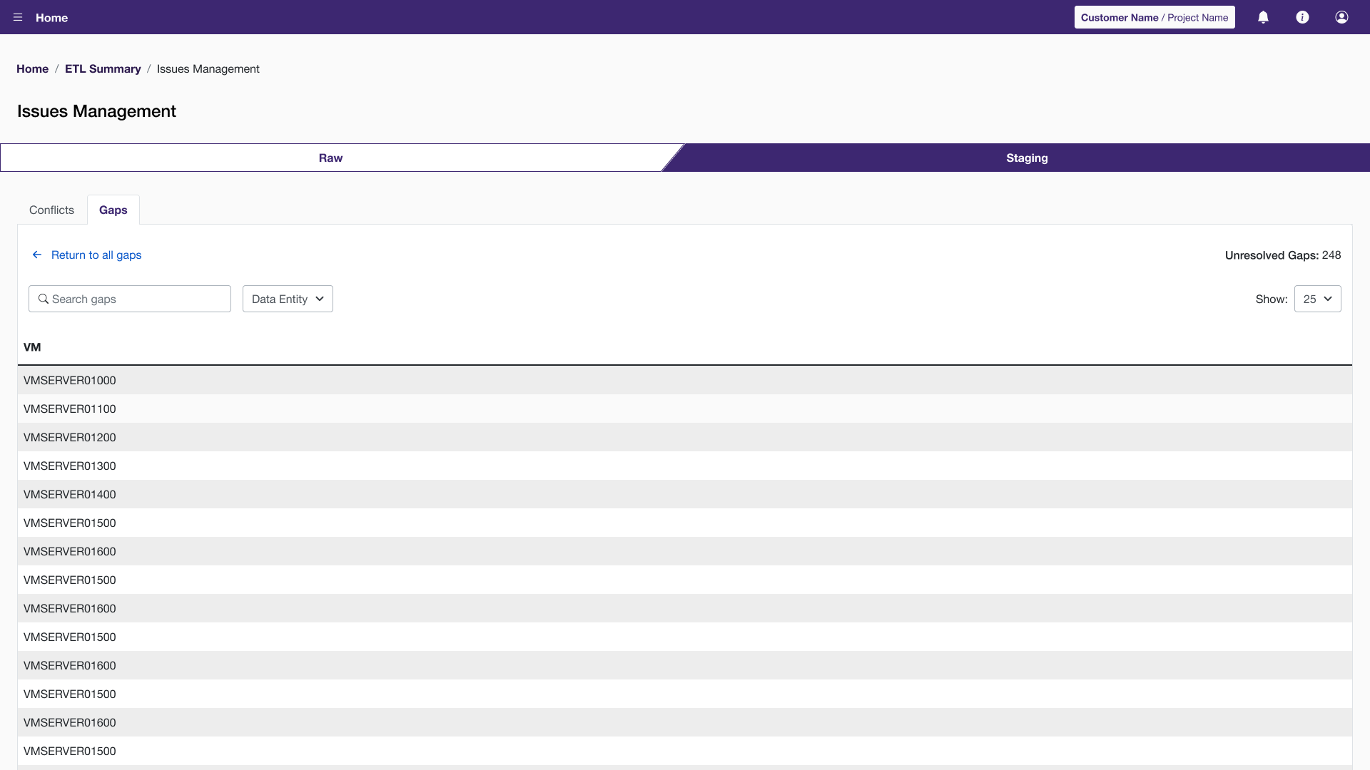
- Clunky interface with excessive information on-screen and difficulty navigating the steps needed to complete the data migration
Anita, The Data Analyst
As an analyst, Anita can be assigned to as many as 5 projects. She is involved in the discovery work of analyzing the data and identifying problems. She works with clients and other team members to resolve any issues. According to Anita: “I barely use the tool because I can do my job faster using spreadsheets and code. Transforming the data is a long and tedious process. I need to perform bulk actions quickly, which is tough to do in the tool.”
Jeff, The Project Manager
Jeff is a project manager for Anita’s customer. Jeff’s company is working to migrate all of their data from an on-premise location to the cloud. He does not need to view the specifics of the project, but does need to get quick reports from Anita. These reports should show problems in the data and the progress made in resolving these problems. In addition, he needs to see the timeline of the migrations in order to report to his bosses.
Rethinking The Process
Before: A Fragmented Process
A fragmented process was a problem for the analysts. As the diagram below outlines, the analysts were utilizing spreadsheets and writing code to identify and resolve issues. This caused issues because multiple analysts were working on a single project. In addition, it was difficult to gather metrics to the customer. The thumbs up indicate anytime an analyst touches the tool. This was important to the business: increasing the analysts’ engagement in the tool to complete projects.

After: A Single Tool For All
With the new process, analysts were able to leverage the tool more. Utilizing a redesigned tool would decrease confusion on how to identify and resolve issues. The recipe would include consistent system feedback to guide the user in necessary next steps.

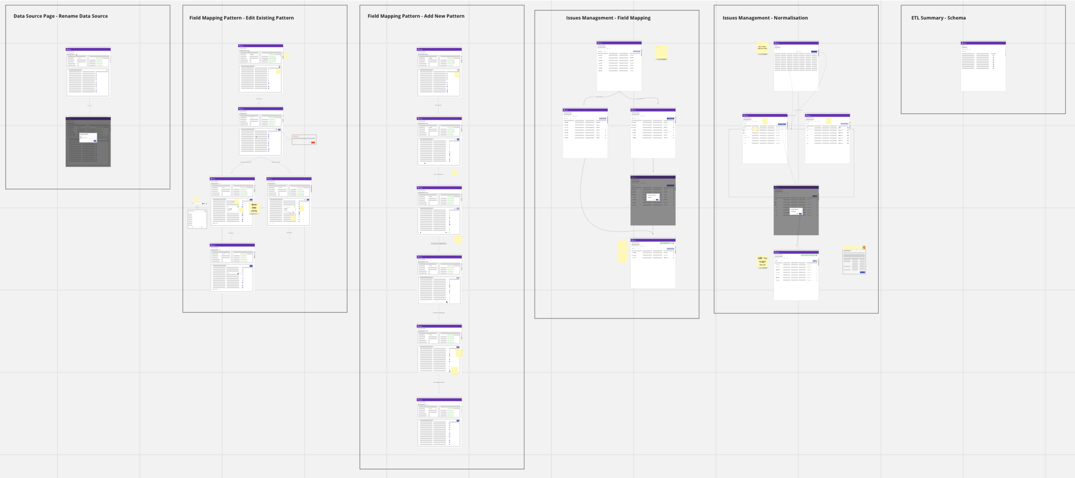
Wireframes and Wireflows
In the early stages of the project, I used wireflows to present to the business stakeholders. The team responded well to this, which is why we stuck to it early on. As the project progressed, I was able to leverage the design system and go to high-fidelity for concepts.
High-Fidelity
With continuous feedback from the business SMEs and the development team, we were able to user test with high-fidelity prototypes. The stakeholders felt this level of fidelity would bring the most valuable feedback. I was onboard with that input because we already had concept validation. The test sessions were focused on usability, therefore, high-fidelity would help the users see the whole picture.
User Testing
There were 5 modules to be redesigned. Each of these modules underwent one round of testing, with plans for further testing once in UAT. I worked with a user researcher for 4/6 modules. With guidance and mentorship, I was able to lead the testing for the remaining modules.
Identified Themes
- Across all phases of a project, there are hundreds of applications and thousands of servers to manage.
- Although the analysts and project managers are technical, they may show metrics from the interface to their customers. These customers are not technical and need plain language.
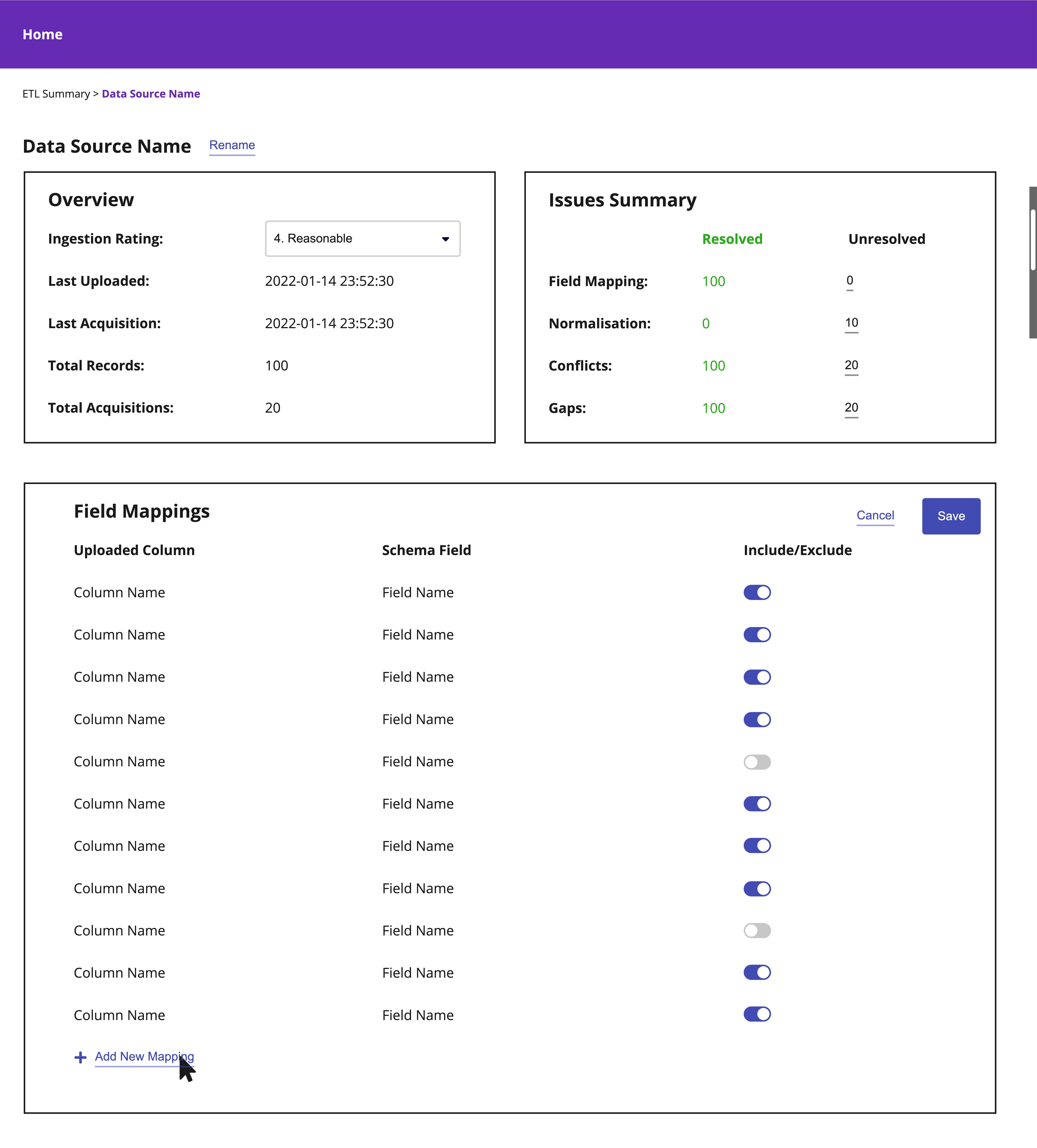
- Entry points for metadata that may be considered as “unnecessary” is essential. The metadata can help inform and confirm decisions when collaborating with the customers.
- Users frequently context switch, especially considering there are steps that could take hours to complete.
Design Considerations
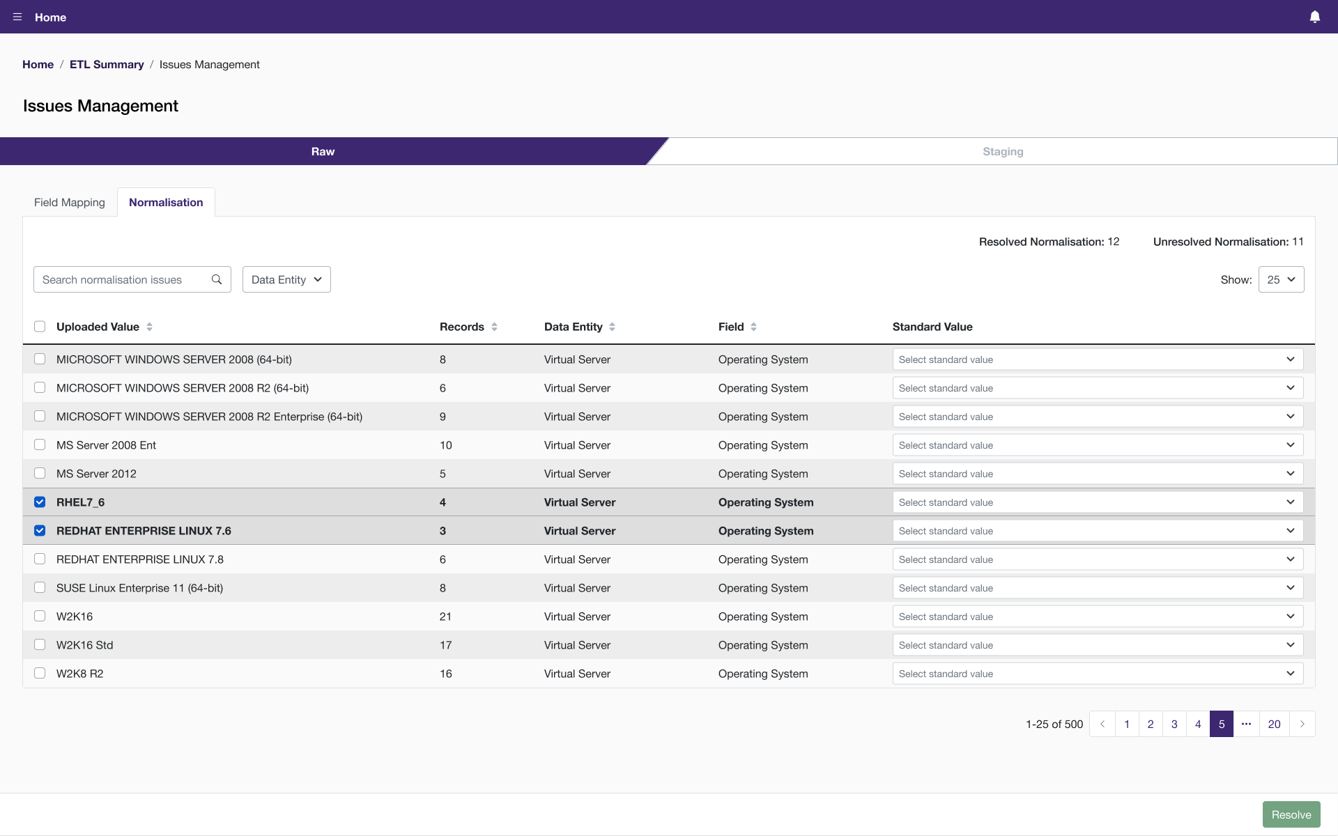
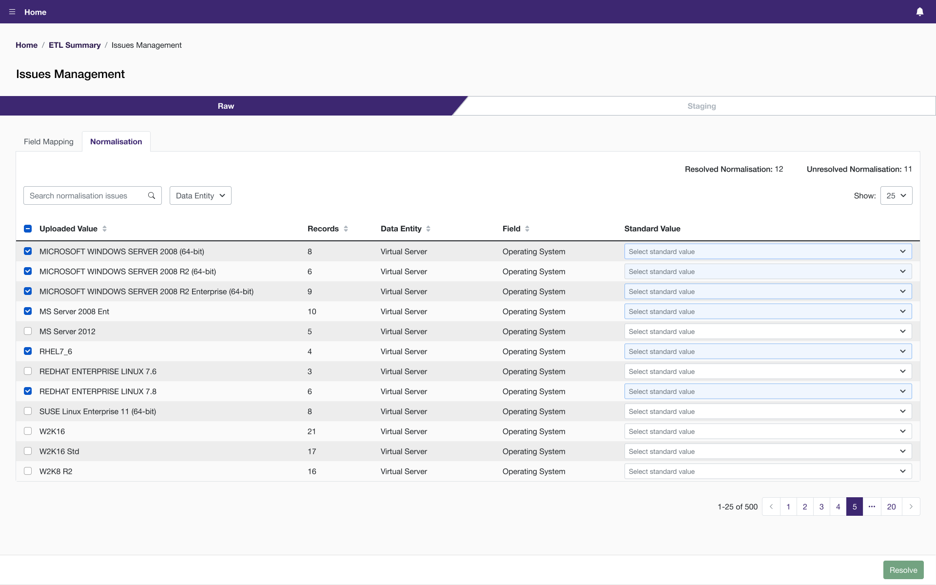
- Batch editing needed to be incorporated when needed and possible, to make the process efficient.
- Plain language and tooltips throughout the interface was not only beneficial in building customer relationships, but also for training of new consultants.
- Quick access to additional details, such as expandable rows and modals, needed to be present when information on-screen was consolidated.
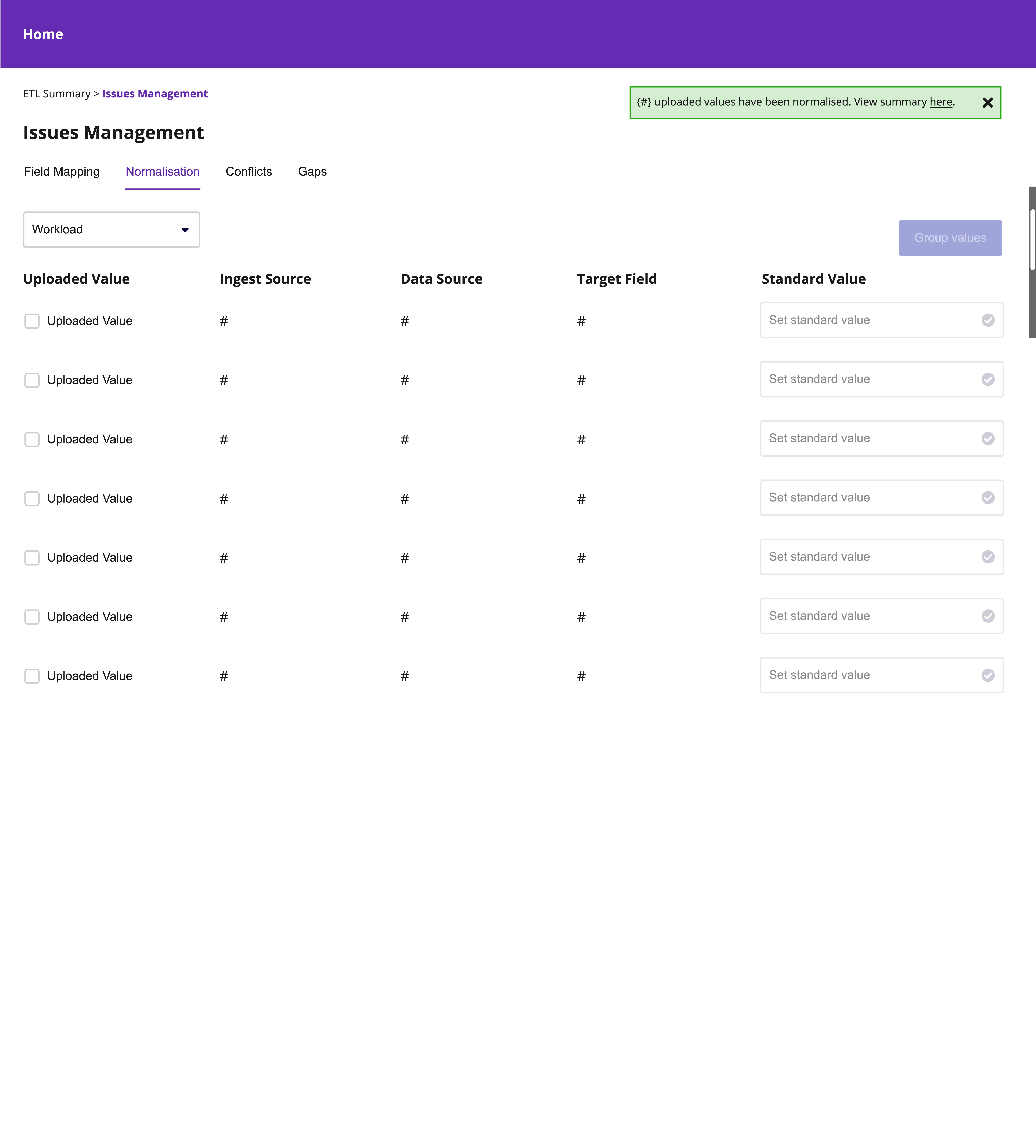
- System feedback (i.e. notifications and alert banners) provide users with the status of their tasks and guide them to their next step.
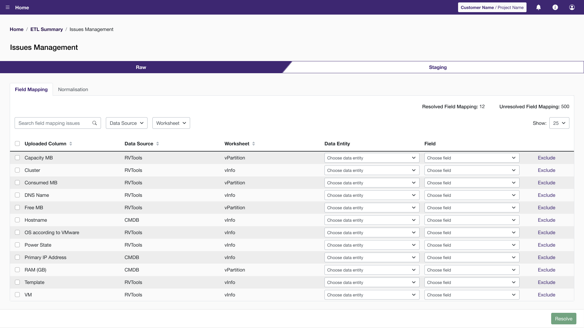
Prioritized Refinements
In collaboration with the business and developers, we prioritized efforts that related to batch editing and improving the system’s guidance of users. The reason being, these themes would immediately impact the user adoption by simplifying the process. Below are a few examples of refinements made.
Batch Editing
Initially, the users would multi-select items with checkboxes. Based on user feedback, we also allowed the users to use the “Control” key on their keyboard. Many other applications have this pattern, but our users were familiar with this through their heavy use of spreadsheets.
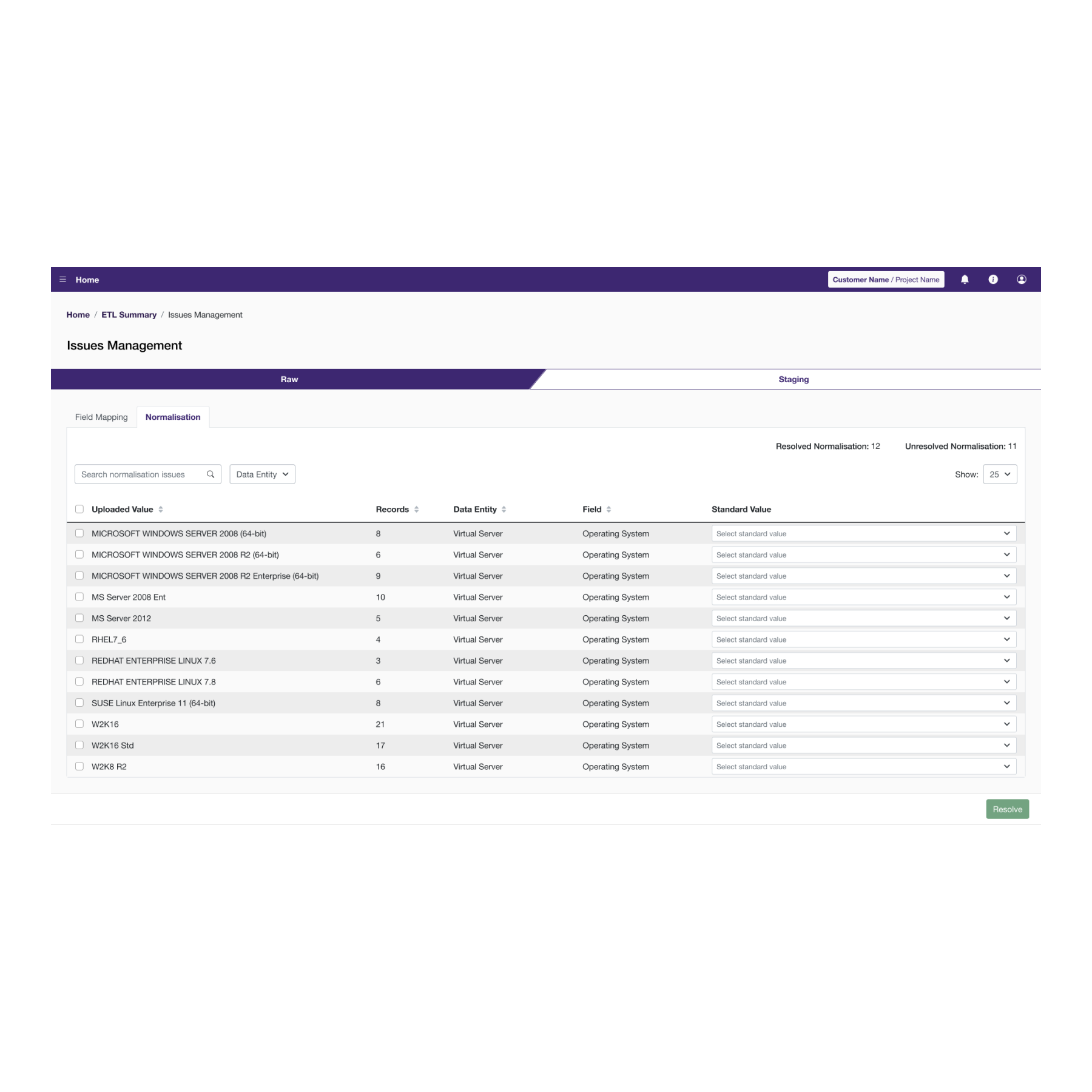
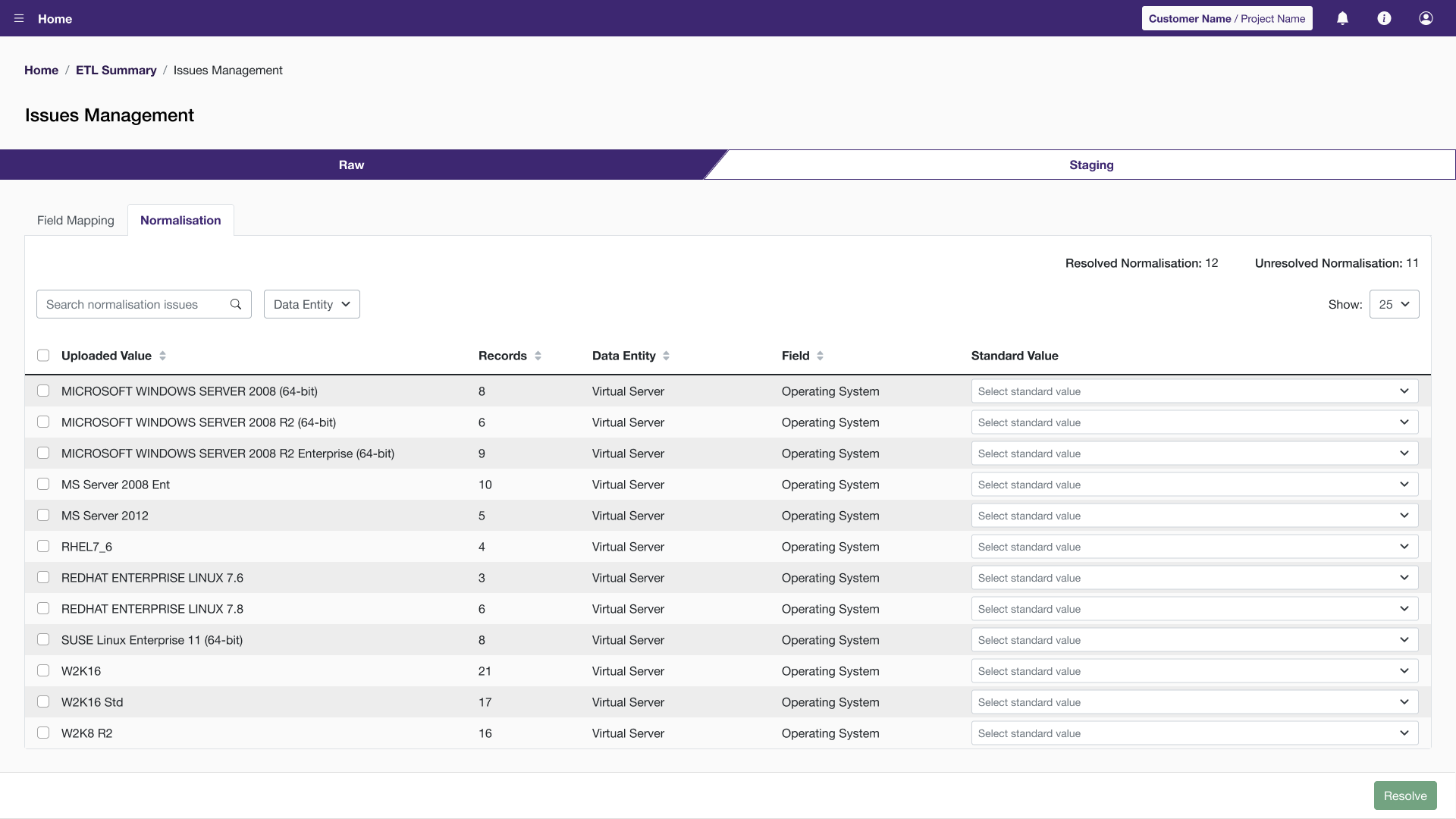
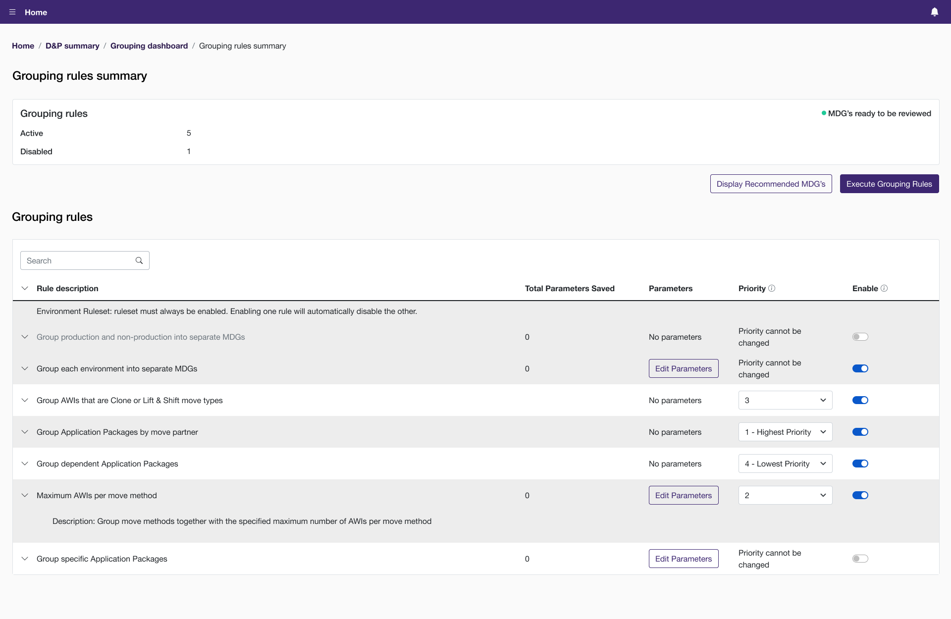
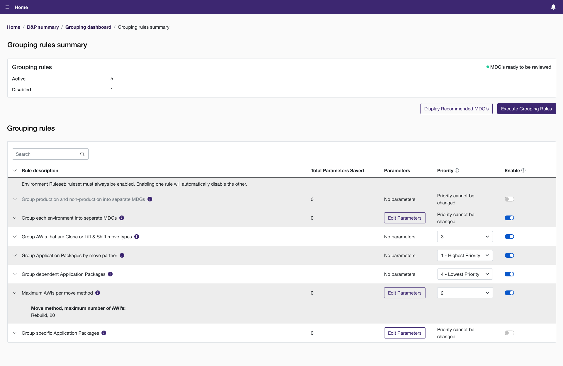
Displaying Metadata
We found that the long description of a rule did not provide value. It was more valuable to display the parameters set for each rule. The accepted recommendation was to use the main content area for the parameters. During user tests, the users could discern the rules with the short descriptions. With that in mind, the long description could be accessed through tooltips instead.
Research Throughout the Project
I frequented the Nielson Norman Group (NN/g) website and UI-Patterns for inspiration and research articles to inform the designs. NN/g is reliable and provides context into their recommendations. UI-Patterns provides visuals but also goes into details about the human behavior. Below is a non-exhaustive list of resources I used during the project.