HIIT Pro
Designing a fitness experience that is personalized to each individual’s fitness experience.
I accomplished many responsibilities during this project, including UI/UX design, interaction design, brand identity and logo, and user research. The project spanned over a time period of 4 weeks, in order to design an MVP for an end-to-end mobile app.
HIIT Pro began as an idea to a problem I encountered when the COVID-19 Pandemic began. I had specific needs for my workout programs while being confined to my home.
Problem
For those with fitness experience, programming your own workouts can be time-consuming and pre-programmed workouts are too limiting. These pre-programmed workouts leave users with little room to tailor to their own fitness levels.
Solution
Empowering individuals in their own health and wellness journey by providing them with a personalized experience. Users will be able to tailor exercise programs to fit their needs and fitness level. Saving customized workouts will save time and effort in the future.
Insight Into the Fitness Space
Market research and competitive analysis provided insights into the fitness market growth, current drivers, and future opportunities.
- The COVID-19 Pandemic was a catalyst for the already hot mobile fitness market, as people were left with few options after the closure of gyms and studios
- Online communities and virtual programs were now the go-to sources for exercise
- The common factor with existing fitness apps is the social connection with the fitness community
Understanding the Users
Before beginning the design process, user surveys were sent out to gain insights for improved empathy of users. A combination of open- and closed-ended questions was used to gather the data - 30% being open-ended to encourage more details from participants.
Insights
- Users who exercise regularly have intrinsic motivators when it comes to fitness, including seeing changes in body composition and endurance
- A social component is a plus but not a necessity, but introduction to it help to increase engagement with the product
Meet Gabby
Based on the primary research, our primary persona was created to empathize with users.
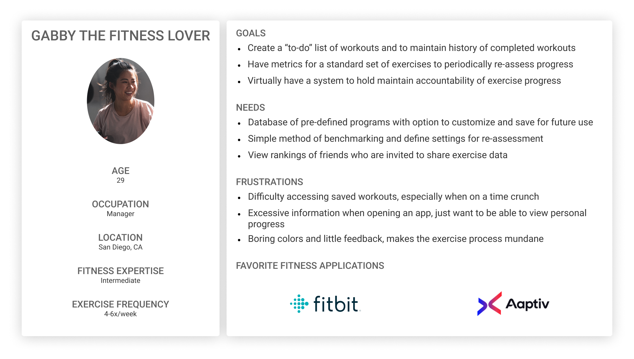
Visual feedback of progress and gamification of the fitness journey provides the positive feedback that complements the intrinsic motivators of exercise.
User Challenges
Point-of-view and How Might We statements were framed in order to identify the challenges users face, in order to begin ideating solutions.
- Difficulty gaining social connection without the physical presence of others
- Creating a good variety of workouts based on available equipment
- Limited time on a daily basis, making it tough to find time for creating and performing workouts
Project Goals
Based on initial research findings and the goals of stakeholders, the following features were identified to have priority in the next steps of design.
- Onboarding
- Routine Customization
- Social leaderboard
Card Sort
An unmoderated, open card sort was conducted to test our assumptions regarding the IA. The test faced some constraints due to limited resources.
- 30 participants would have been ideal to improve the level of confidence, but a total of 6 was recruited
- A tree test to follow-up with the card sort would help to confirm usability of the app hierarchy
Assumptions
There were 4 assumptions when planning the card sort. Half of these assumptions were confirmed, while the others were not but still gave insight into the next steps.
Confirmed
- Default and custom routines should be located in the same section
- Numbers are a familiar way to grade level of difficulty, which should be used to categorize the workouts
Proven Wrong
- Sub-categories with targetted muscle groups will be helpful for users to preview
- Personal metrics and social elements on the same screen will help users gain insight into their ranking relative to peers
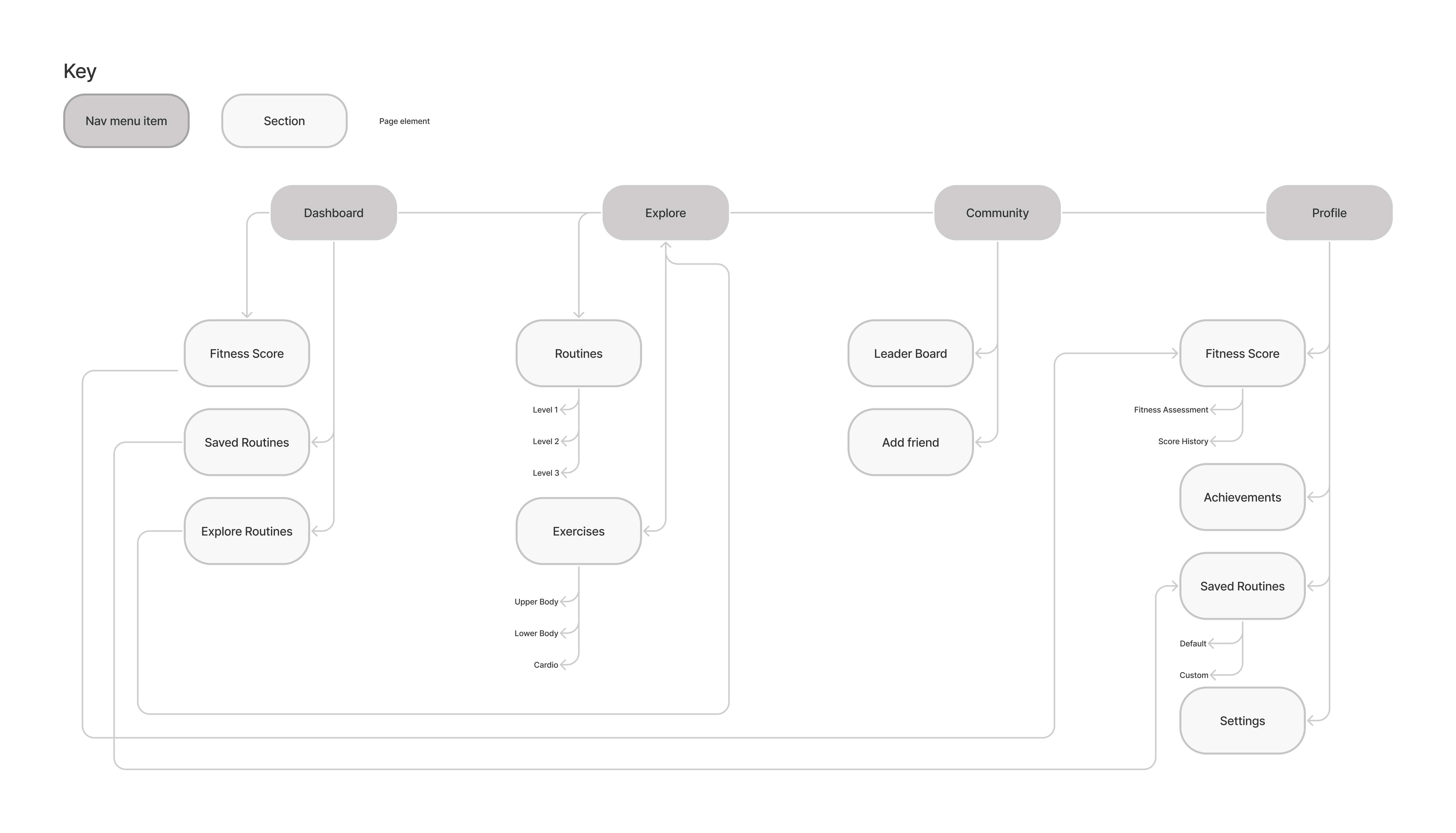
Sitemap
The goal of the final sitemap was to maintain a simple IA and not give users a reason to be deterred from completing a workout.
Exploring Design Patterns
Research on existing design patterns was done to learn about existing patterns that would carry over well for HIIT Pro. The focus of this exploration was focused on patterns to be implemented in HIIT Pro:
- Navigation menus
- Library and search
- Leaderboard
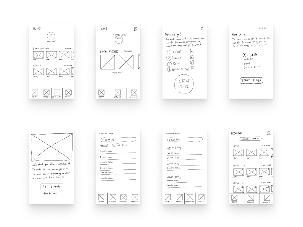
Sketches
Sketches were completed after exploring design patterns that led to the following decisions:
- Navigation: a static tab menu at the bottom of the page would be easiest for users to navigate, especially since there are only 4 nav items
- Library and search: a search input field alongside tabs is fitting for the exercise library in HIIT Pro
- Leaderboard: a standard ranking pattern would be used to employ the social component
Mid-Fidelity Prototype
Following the sketches, user flows were completed to focus on the 3 priority tasks for the prototype: assessment onboarding, routine modification, and viewing the leaderboard. A mid-fidelity prototype was used for usability testing to ensure that the flow would be intuitive for users to complete the tasks. This way iterations could be made to the flow prior to completing the high-fidelity prototype.
Usability Testing
Plan and Constraints
A moderated test was conducted to have participants walk through the mid-fidelity. Due to limited resources, a total of 3 participants were recruited. With more resources, 5 total participants would have been the ideal plan.
Findings
The findings of the usability test led to priority revisions that include the modification task flow. The success rate of this flow was 45%, indicating that the interaction to trigger the modification feature has poor discoverability and carryover.
Insights
Findings also indicated a need for a more detailed onboarding process, which is important but was prioritized for later as resources grow. During usability testing, users were found to be confused by the terminology of the content: levels, routines, exercises.
Priority Revisions
Version 1
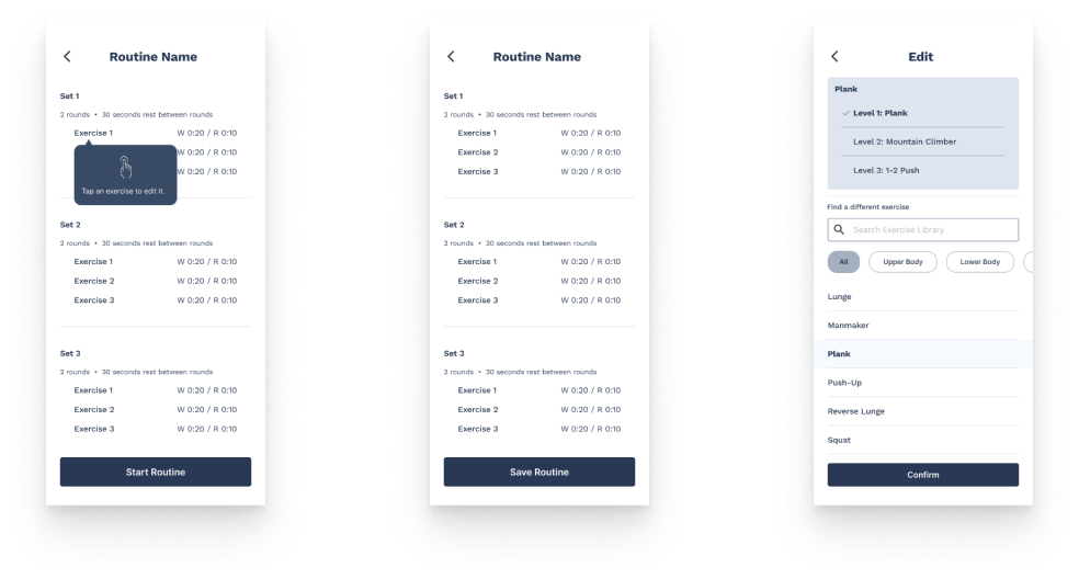
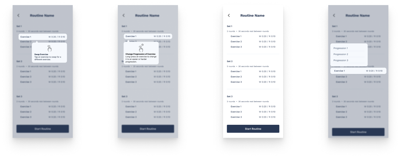
Coach marks were used to introduce the modification features for the routine. Long-press and tap of an exercise would enable users to make the necessary modifications. The success rate of the task was 45%. This indicated that the interaction to trigger the modification feature needed to be iterated on to improve its discoverability.
Version 2
There is a single coach mark that introduces the modification feature. The interaction now involves a tap that navigates another screen to change the exercise.
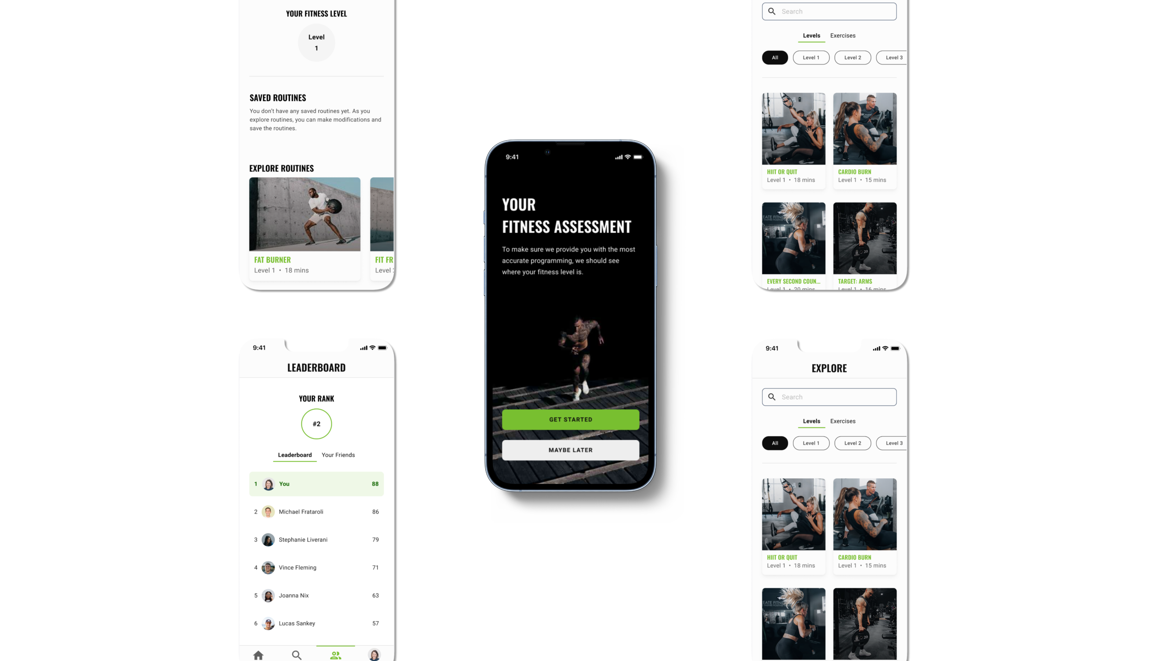
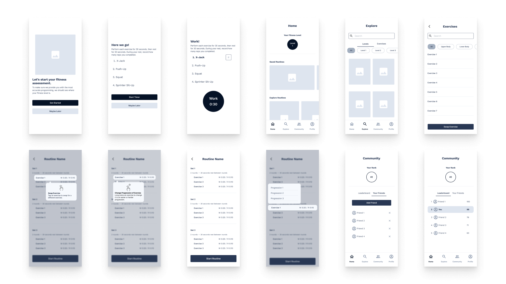
High-Fidelity Prototype
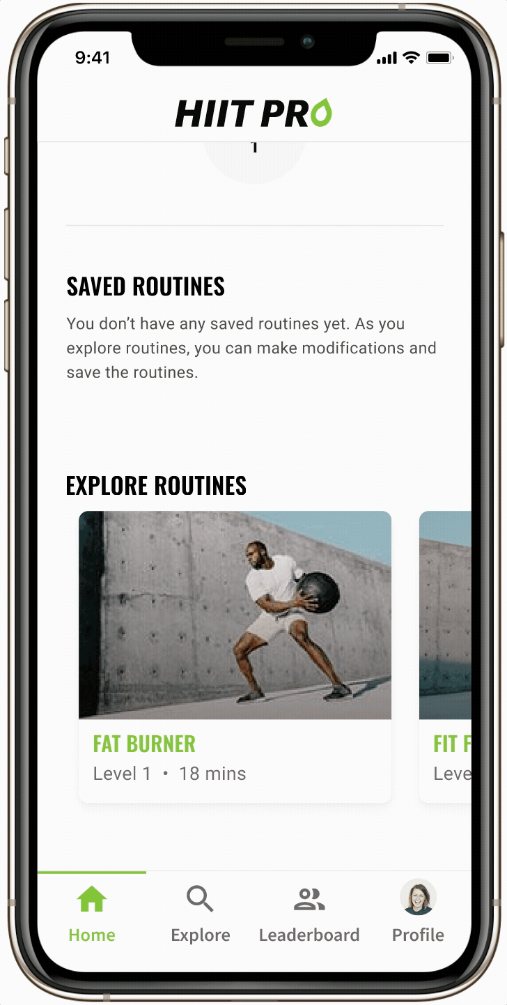
Home
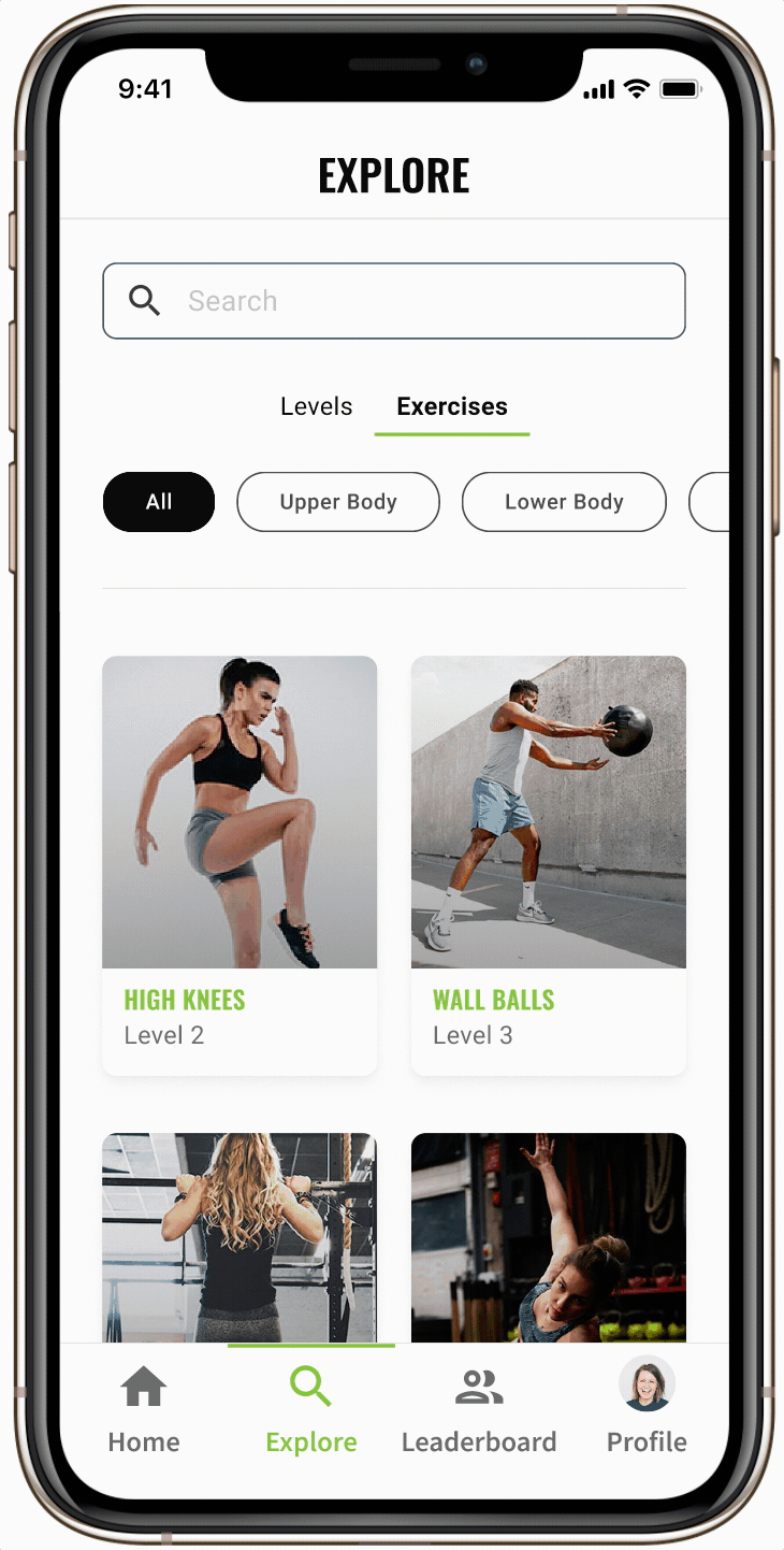
Explore
Routine customization
Next Steps
The next priority for HIIT Pro is to iterate on the onboarding flow. Users need a way to learn the terminology used within the app and a walkthrough of the customization flow. Once this onboarding is designed, the prototype is to undergo usability testing.
Lessons Learned
Immediately after usability testing, I recognize a massive mistake I made in the interaction design. Users were only able to access primary features with gestures. Why was this a mistake?
- Gestures are not common for all users, therefore, discoverability and familiarity is low amongst users
- Users should have a more direct way to access the features, with gestures as a secondary method
For the Future
Digging a little deeper into common gestures and use cases will be a step I take in future projects. Admittedly, I was excited to incorporate gestures and 3D touch into my design. But lacked insight into the ambiguity of gestures. So for the next time, I'll know to deeply explore the reason for an unfamiliar pattern and how it can be used successfully.