Learn UXD
Project-based learning for designers and developers
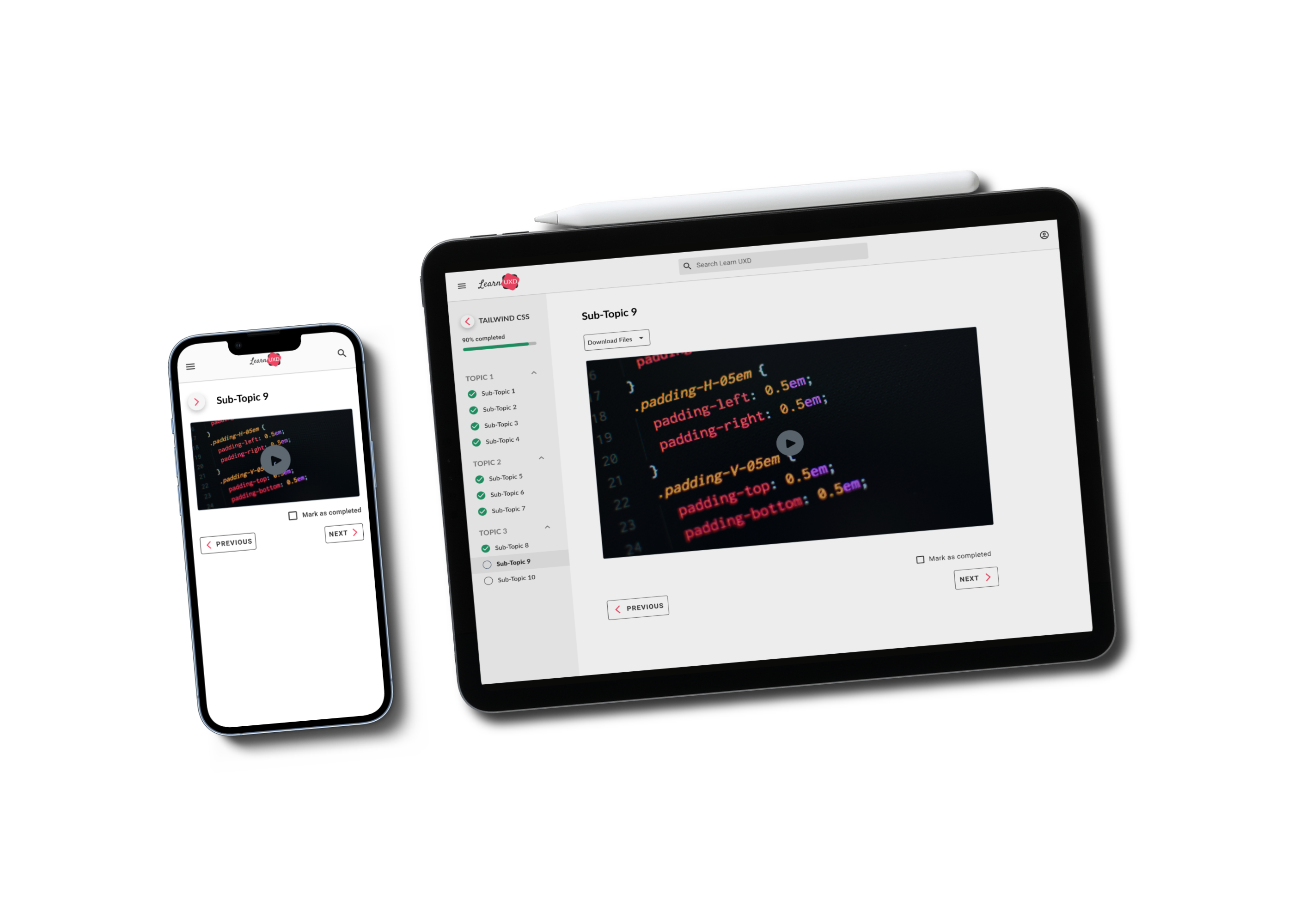
Final Prototype
Problem
There are so many resources available, users are left chasing multiple resources. Having a single resource to meet the needs of users will help them reach their goals quicker. Users need access to their content on any device in order to improve their learning experience.
Solution
Design a responsive interface to allow users access to their learning content. The interface will facilitate the interaction between users and the content in order to ensure an easy and enjoyable learning experience.
Empathy For the User
After conducting market research and competitive research as the secondary research, user interviews were conducted as the primary research. This research provided the following insights to move forward with the next steps for user research:
- The COVID-19 Pandemic led to an increased transformation of e-learning needs. From a global perspective, traditional education is no longer the only way to meet the needs of employers. Nontraditional programs are not transforming the way employers meet their staffing needs
- Users who turn to e-learning want quality content on an interface that is simple and easy to access their learning content. Users don’t want to spend more time navigating to their content, they want the time dedicated to digesting that content
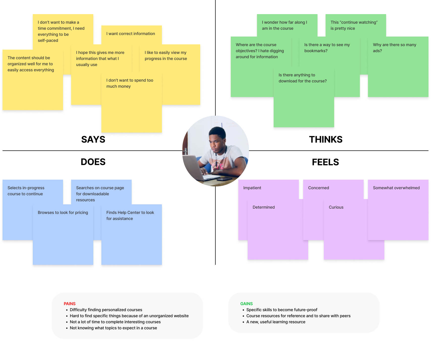
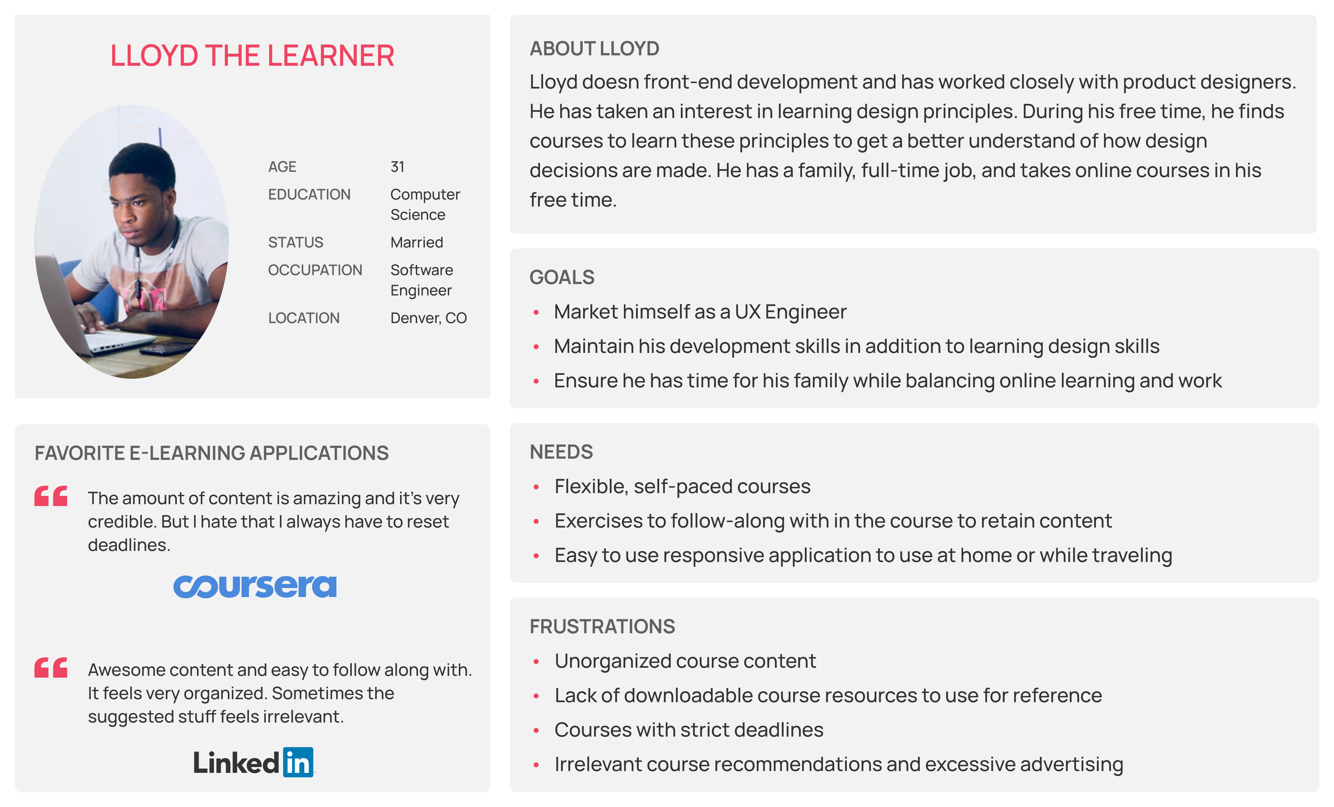
Primary Persona
After the secondary research, primary research was completed by interviewing participants. The goal of the interviews was to explore learning styles, positive reinforcement during learning, and frustrations with online learning. After completing the primary research, the primary persona was created: Lloyd. This persona was used to create an empathy map to get in the shoes of our target user. In addition, Point-of-View and How Might We statements were written to brainstorm solutions to the problems users want to be solved.
Defining the Project
Project goals and the feature roadmap were created to align expectations for the next step. Based on this, the features, we decided to ideate on were the following:
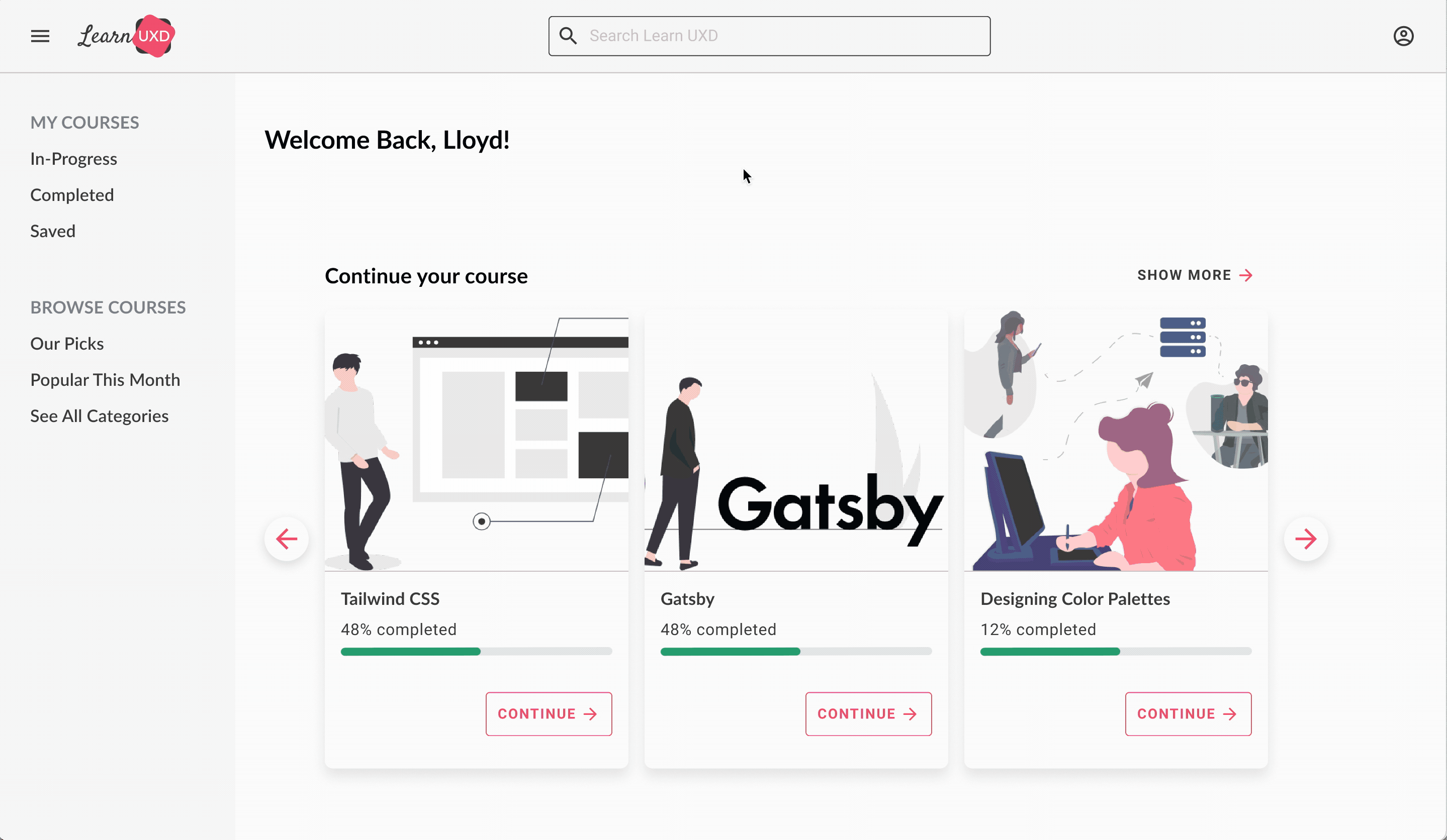
- User homepage
- Resume in-progress courses
- Interactive course syllabus
- Preview of course progress
- Selecting next/previous section in the course
Tree Testing
To determine the information architecture (IA) of LearnUXD, we used Optimal Workshop to send participants our tree test. The decision to use tree testing was determined by 2 reasons:
- LearnUXD aims to be simple for users to navigate. The content is targetted towards a specific audience, therefore, there is not a broad variety of information to organize
- Time constraints limited our ability to perform a card sort prior to the tree test
Findings of the tree test provided the following insights:
- The assumed IA presented to the participants was successful and safe to move forward with
- Course progress on multiple pages provides users with the visual feedback to motivate them towards course completion
Task and User Flows
Task and user flows were focused on users selecting their in-progress course from the homepage and completing the course.
Mid-Fidelity Wireframes
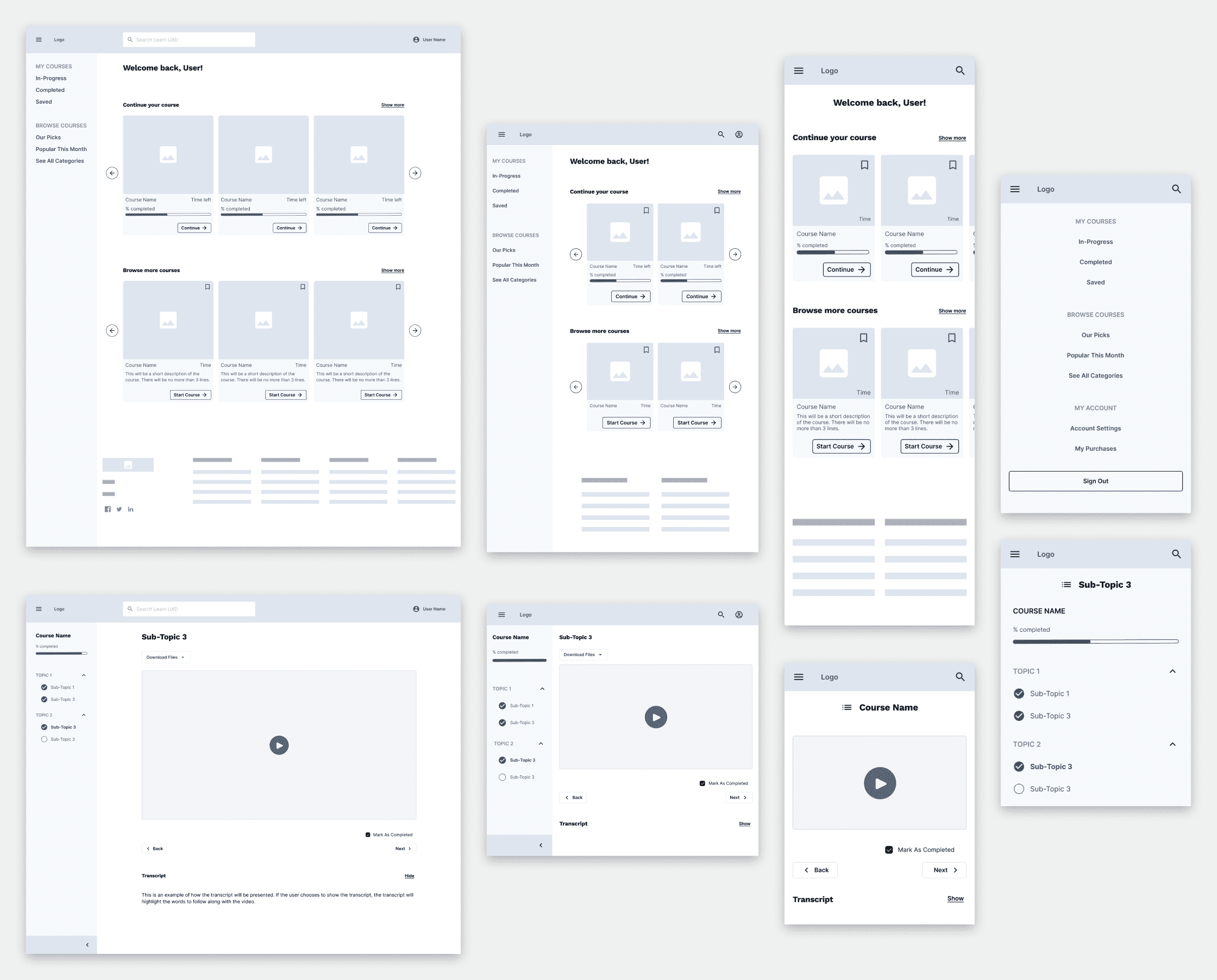
Prototype
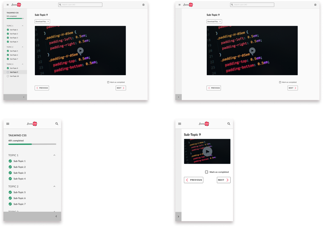
Version 1: collapse/expand button for contextual menu can be accessed at the bottom of the menu.
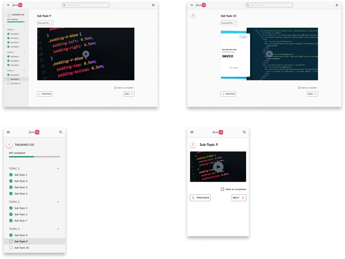
Version 2: collapse/expand button repositioned at the top menu, next to the course name.
Usability Testing
Subject and Methodology
Desktop version 1 and version 2 were tested. Maze was used to perform remote testing. There were 5 participants that we split into 2 test groups:
- Group A: given version 1 first, then version 2
- Group B: given version 2 first, then version 1
Based on the results of the desktop usability testing, we would use the respective version of mobile to complete its usability test. For mobile, we approached it by interviewing 3 participants in a semi-structured format.
Goals
Participants were given a combination of tasks and follow-up questions based on each prototype. The goal of the usability test was to determine the following:
- Which version of the contextual menu would have a higher usability rate
- The rate at which participants would successfully complete a course
Results for Desktop
Based on the desktop usability test results, we decided that version 2 of the prototype would be used to proceed with mobile testing.
Global Menu
- 83.5% of participants successfully located the menu and identified how to collapse/expand it
- The barrier here was the wording of the task instructions, resulting in increased task time and misclicks
Contextual Menu Version 1
- 33.3% of participants successfully found the contextual menu and collapsed it
- The location of the collapse/expand button at the bottom of the page resulted in poor discoverability
Contextual Menu Version 2
- 50% of participants successfully collapsed the contextual menu
- The button at the top of the menu was more discoverable but was confused with the global menu icon
Course Completion
- 79% of participants successfully marked all sub-topics completed and reached the congratulations modal
- Participants expected the course to automatically be marked as completed, resulting in misclicks and additional time
Usability Test Insights
- Participants and the data say that version 2 of our prototype is the winner. Regardless of which version of the contextual menu was tested first, V2 demonstrated a higher success and usability score
- Course navigation and marking sub-topics as completed were successful with good data. The question raised here is whether marking a course as completed should be done automatically by tracking the user’s progress on the sub-topic
Priority Revisions
Desktop
By default, the contextual menu will expand each time the user moves onto the next sub-topic in the course. This pattern will provide users with feedback on an updated course progress indicator.
Mobile
Unlike desktop, the contextual menu will remain collapsed as a user moves onto a new sub-topic. Since the contextual menu occupies the full-screen space, this pattern prevents the menu from becoming intrusive to the user. We will give users the freedom to collapse and expand the contextual menu if desired by the user.
Additional Insights
In both desktop and mobile, the “Mark as completed” option will be selected by default based on the user’s tracked progress on the sub-topic page. If the user wants it unchecked, they will have the option to do so.
Next Steps
- Initiate usability testing of the global menu by designing another version to test against the current version.
- The current design of the global menu led to confusion of the contextual menu discoverability
- Other options should be explored for users to interact with the global navigation items, to make the differences between the global and contextual menus apparent
- Re-think the IA to improve the global navigation items
- Explore alternative options for “Browse Courses” categories
- Allocate time to initiate open card-sort testing to understand what participants intuitively expect for this menu